Horizontal Overlap
This item has the maximum width set to 1500px. The image starts at column one and spans six columns. The text starts at column five and spans three columns.
EverWeb
Creative
Design
Widgets
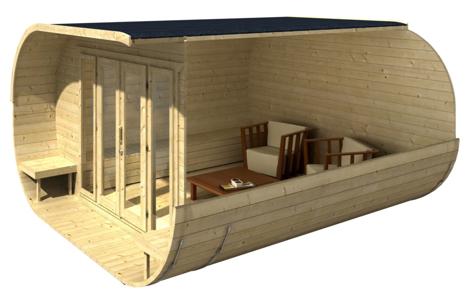
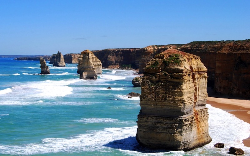
The grid has 8 columns and 6 rows. The image spans all the columns . It starts at row 1 and spans 5 rows.
The text starts at column 6 and spans 2 coumns. It starts at row 3 and spans 4 rows to extend it beyond the bottom of the image. The align-self selector is set to "end"
Mobile Styles
The image fils the grid container background by changing its row span to 6.
The text is set to start at column 1, span all 8 columns and occupy the last row.
The grid-column property specifies a grid item's size and location in a grid layout, and is a shorthand property for the :grid-column-start and grid-column-end properties.
The grid-row property specifies a grid item's size and location in a grid layout, and is a shorthand for the grid-row-start and grid-row-end properties.
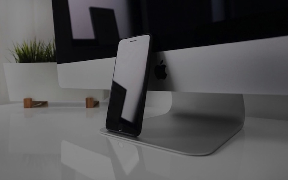
This text block overlapping the graphic is created using a responsive grid layout.
The grid is 8 columns wide. The image starts at column 3 and spans 6 columns.
The text starts at column 1 and spans 4 columns. Its align-self property is set to center so that it is vertically aligned in the center and it has a margin of 20 px to inset it slightly to allow room for the box shadow.
If the align-self property is set to "start" the text will move to the top and if set to "end" it will move to the bottom. The text area can occupy the full height if the align-self property is set to "auto"