Image FX Hover Grid
The responsive image grid can have up to six images per row. The hover effect is created using CSS3 and causes the image to scale up and the caption and CTA link tab to appear.
Responsive
The grid is responsive and has two sets of media queries to change the styles for tablets and mobile phones. Since the hover effect will not work on touch devices. the overlay with the captions and info link are display. The grid switches to two items per row when viewed on phones in portrait mode. If viewing this page on a computer reduce the browser width to see the effect of use the browser's responsive mode.
Images
The images need to be cropped to the same size before importing them into EverWeb or dragging them from the Finder onto the Assets List in the widget settings. The image width should be equal to the maximum size that it will be displayed at in the browser. For example, if the grid has four images per row and the maximum width setting is 1200px, the images should be 300px wide.
Grid
The number of images per row is set by choosing a suitable percentage width for the images. The options are: 16.66|20|25|33.3|50
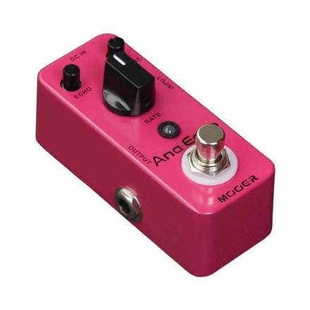
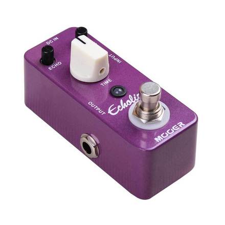
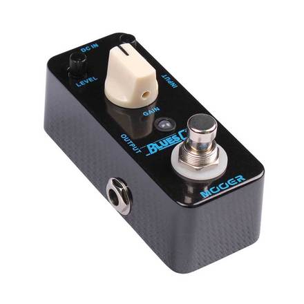
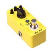
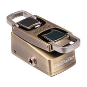
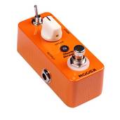
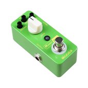
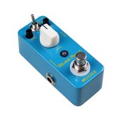
There is a control for setting a border around each image. This is used in the above example since these are product images shot on a white background.
The caption and CTA link font size and color can be set as well as the link border and hover colors.
Responsive Page
Since the grid is fully responsive, it is not really suitable for use on its own unless it is the last or only item on the page. There is an optional text area with a heading and a paragraph. Along with the optional footer with auto copyright update and a smooth sroll to the top chevron tab, this allows the creation of a fully responsive page when combined with a suitable header with built in navigation which switches from inline on computers to "hamburger" icon drop down on touch devices.