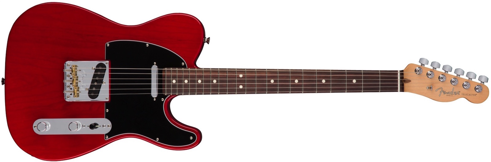
AMERICAN ELITE TELECASTER ®
Fender Telecaster
The American Elite Telecaster is the original solidbody electric guitar reimagined for modern players who want bleeding-edge performance with timeless visual style.
The future of workhorse guitar design, this Tele® guitar’s stunning style, easy playing feel and flexible sound that meets any musical need, was made to tear it up on stage or in the studio.
Hero Text & Image
The banner is made up of two equal sections - one with an image with optional caption and hyperlink and the other a text block with heading, text and an optional CTA style link.
The banner is full width responsive with a fixed height and the content is vertically centered within it.
The sections can have contrasting backgrounds as show in this example or they can have a vertical divider. There's also options for adding a top and /or bottom border.
Image
The image has alt text and an optional caption. It can be created as a hyperlink with a change in opacity on hover. The image's percentage width is adjustable and it also has a maximum width setting to stop it overspilling the container at wide browser settings.
There is a control for positioning the image to the left or right so that, when several of these widgets are stacked, the image positon can be alternated.
Text
The content block has an h1 heading, a paragraph and an optional link.
The text can use a web safe font or non web safe or Google hosted font with a web safe fallback. There is a control for setting the amount of inset from the section edge.
The tab creates a hyperlink to an internal page and can be styled for font color, hover color, background and hover background colors and border width, color and radius. The link tab can be aligned left, center or right.
Responsive
Reduce the browser width to see the responsive action or check out the page in the browser's responsive mode or the iOS Simulator. See the Testing page for more info.
The banner will work well on the full site and when the page is loaded on a tablet device like an iPad. If used on a fully responsive page, make sure the height is sufficient to stop the content breaking out of the container on mobile phones.
Since the banner is fixed height, two or more can be stacked vertically on a page if required and the optional top and/or bottom border used to separate them visually.