Animated Side Links
The design brief was to create animated slide out links which could be stuck to the browser/device left and be kept in view for linking to essential items like a contact form, email, phone etc.
Rather than use javascript, the animations are created using CSS transitions on the tab width and the text opacity.
When viewed on computers, the icon tabs slide out on hover and the icon is hidden and replaced with text which fades in by animating the opacity.
Although the links will work on touch devices, it is not desirable to have them obstructing the content so there is an option to turn on a responsive mode. Media queries are used to switch the layout to inline tabs showing the icon which stick to the bottom of the device window. The navigation layout is changed to a table and each link becomes a table cell to allow the use of the CSS "calc" selector to do the math to determine the percentage width of each item. This only requires the user to enter the total number of links into the widget settings.
If viewing this page on a computer, reduce the browser width to see the layout change. To see how it looks on different devices, use the browser's responsive mode or the iOS Simulator.
Links
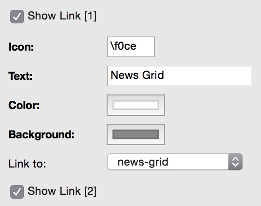
The links use the Font Awesome icons and are added by checking a box and entering the unicode for the icon, the text shown on hover, the icon/text color, the tab background color and choosing the "Link to:" page.
The example shown on this page use different colors - not because it make any design sense but just to show that it can be done!
The last two links can be configured as a phone and an email link.
The phone link shows the phone number on hover when viewed on computers. On mobile phones, tapping the icon will call the number.
On any device, clicking or tapping the email link, launches the visitors email client. There are fields for adding the email address and subject.
The widget can use a web safe font or a non websafe or Google hosted font with web safe fallback.
There are controls for adjusting the font size, the width of the tab on hover, the vertical spacing of the tabs and for rounding the outer corners.
NOTE: The hover width must be set to accomodate the tab with the most text.
To use the responsive mode, check the box in the widget settings, select a suitable break point and enter the number of links used in the navigation.
Before publishing, the widget should be set to "Always On Top" using the Arrange menu or the Metrics inspector. Check the "Fixed Position" box and set the required distance from the top to clear the header.
Font Awesome
A full list of the Font Awesome icons can be found HERE. As mentioned earlier, the unicode for the icon is required in the widget settings. This must be entered with a backslash like this: \f0ce
To find the unicode for a specific icon, click its entry in the complete list of icons. This will bring up a page with the icon and the unicode is show below the icon examples.
Font Awesome icons can also be found quickly by Googling them. For example try "font awesome home" and you will get a Google entry which also shows the unicode.
Note: The icon code can be replaced by a single letter or number if required.
Follow the link below to see a similar type of navigation for social media sharing links.