Slide In Navigation
The two level navigation slides in from the left at a preset distance from the top of the browser/device window when the menu icon tab is clicked or tapped.
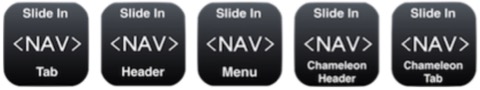
This navigation menu can be used with four different widgets which trigger the slide in and out …
[1] The header shown above with the built in icon.
[2] The stand alone icon
[3] The header with chameleon icon which changes state between open and close.
[4] The stand alone chameleon icon.
Header
The full width, responsive header has an h1 heading for the website name, an optional logo and a "hamburger" style tab which opens/closes the menu itself. Its background opacity is adjustable.
The centered heading can use a web safe font or a non web safe or Google hosted font with a web safe fallback. Its position Y can be adjusted to align it vertically.
The heading font size can be reduced when viewed on smart phones and the vertical position adjusted to compensate.
The optional logo can be placed left or right and has conrols for adjusting its position on the X and Y axis.
The navigation tab is created using pure CSS and has controls for adjusting the color, background color and its opacity and the border radius.
The tab can be positioned left or right and its position adjusted on both the X and Y axis.
Tab
An alternative to the responsive header is a stand alone navigation tab which can be anywhere on the page layout. It is exactly the same as the one incorporated in the header shown above.
Navigation Menu
The menu can have up to six top level links and three directories - each with up to six links.
The directories show a chevron down icon and open accordion style on click or tap. In the open position, the icon changes to a chevron up.
The links within the directory have a cheron left icon.
The navigation width can be adjusted using a drag handle or the Metrics inspector and the widget height increased to show all the links if necessary.
Since the navigation is hidden on page load, it can be positioned outside of the content area to the left by checking the "Allow free dragging" box in the Metrics inspector.
NOTE: The navigation must NOT be positioned to the right of the content area. Doing so will cause the page layout to be forced to the left when viewed on a touch device like an iPad or iPhone.
Prior to publishing, the position of the navigation from the top of the browser/device window should be set and the box checked to hide it.