Responsive Switch Tabs
Tabs are useful for packing a lot of info into a small space but have problems when used in a responsive design. The best approach is to have them switch to an accordion style when viewed on mobile phones.
If viewing this page on a computer, reduce the browser width to see the change from tabs to accordion.
Tabs
Tabs are added as needed - up to a maximum of ten - and named as required. They can be styled for font size, color, background and border radius with the active tab having the option of a different color. The tabs can be aligned left, center or right in relation to the content.
Note that any tab can be assigned as the active one so that its corresponding content box is open on page load.
Content
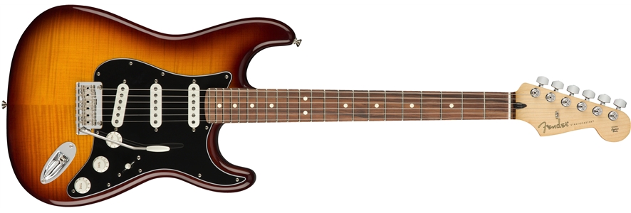
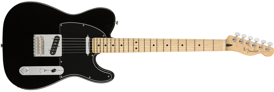
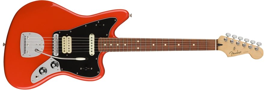
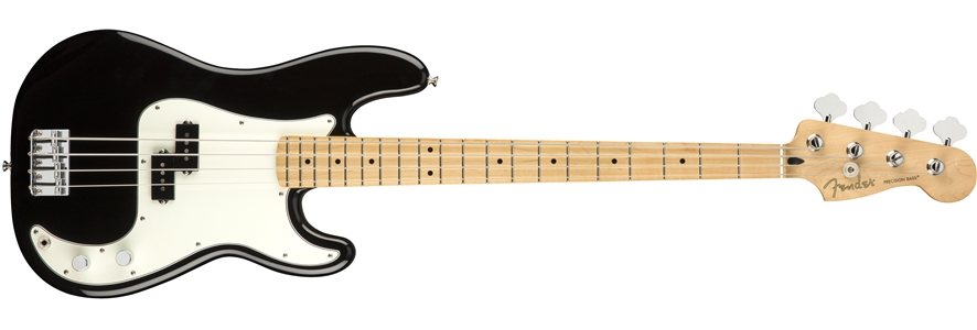
Content blocks have options for an image with alt text, a heading, a span for price/date info, a text block and a CTA style link. The link can be aligned left, center or right and can open internal or external pages with a new window option.
The content can have a border and radiused corners if required.
TIP: When setting up the content for any tab, select it as the active one to be able to view it one the EverWeb design canvas.
Accordion
The accordion displayed on mobile phones inherits most of the tab styles.
The border - if added - is hidden and the content becomes full width.
The tabs for opening/closing the content blocks can have a separator using the controls for "Acc Separator" and the separator color selector.
Wrapper
The overall wrap has controls for background color and its opacity and there is a control for spacing the item vertically from those above and below it.