Step-By-Step
The responsive timeline widget is used here to create step by step instructions. It uses a pure CSS solution which makes it more suitable for responsive pages than one using javascript.
The widget uses the EverWeb widget API to create the items so up to 48 can be added. The label, marker and timeline appear automatically when an item is added.
Label
On wide screens, the label is located to the left of the timeline. On the narrower screens of tablets in portrait mode and phones, the label switches to the right of the line and all the other items move downward to accomodate it.
Timelime
The timeline and its markers have options to change the colors. The marker has a hover animation when viewed on computers.
The time line can be included or excluded from the last item in the list.
Content
Each item can have a title, an image with alt text, a contrasting field for date, time etc, a text block and a link.
The image, time and link options need to be turned on globally if required.
The images are centered and can have less than 100% width if required. The width becomes 100% when viewed on phones.
Note that this timeline can be used without images if required.
CTA Links
Although inks are turned on globally, they also need to be turned on individually. That way, not every item needs to have a link as can be seen in this demo.
The links can be configured with a relative or absolute URL and open in a new window if required.
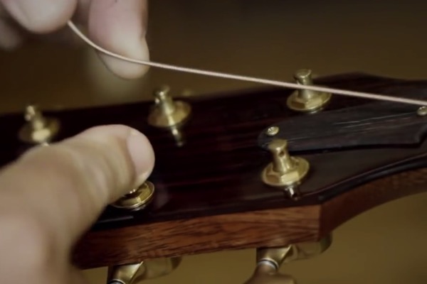
![Step [6]](ewExternalFiles/restring-6.jpg)