Responsive Sticky Sidebar Links
This type of layout is useful when a sidebar needs to remain in view as a long section is scrolled. A sidebar - or any other item - can be made to stick easily enough but it takes a little more to get it to stick within a parent element and scroll with the parent when it reaches the bottom.
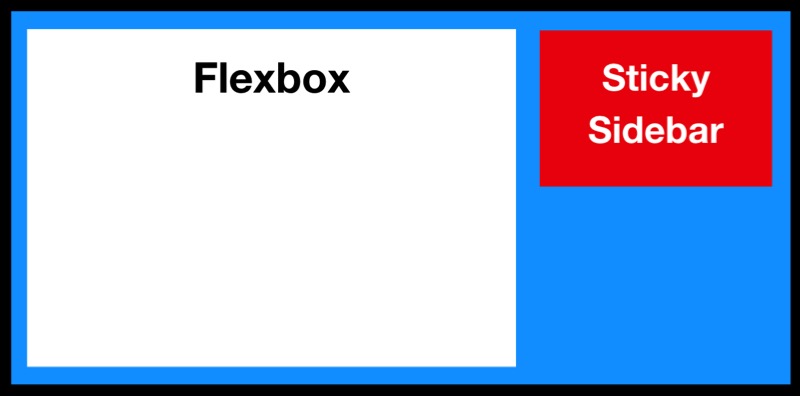
The widget layout consists of an HTML5 section element with a maximum width set and centered in a full width wrapper. Inside the section is an article for the main content and an aside element for the sidebar navigation.
To avoid using Javascript, the section and the article elements use display:flex. The flex property is a sub-property of the Flexible Box Layout module.
This layout then allows the use of position:sticky to fix the position of the sidebar when the section is scrolled.
The main section has an h1 heading, an optional image with alt text and a text block. The image is centered and its percentage width can be adjusted.
The aside element has a fixed height set in pixels. This can be adjusted to suit the number of links or set at a lesser height to allow the content to scroll.
The sidebar links are displayed as block level elements so that they stack vertically and are very simply styled with an optional separator.
Media Queries
To change the layout when the browser width is reduced or the page is viewed on a touch device like an iPad or iPhone, media queries are used to change the layout from display:flex to display:block.