NOTE
EverWeb Widgets is an independent developer of widgets for the EverWeb web design software.
EverWeb Widgets is NOT associated with Rage Software - the developers of EverWeb.
EverWeb Widgets is an independent developer of widgets for the EverWeb web design software.
EverWeb Widgets is NOT associated with Rage Software - the developers of EverWeb.
Splash pages are usually avoided since they usually have very little text content. This means that there is nothing much for the search engines to index.
This widget solves the problem by animating the splash item in over the page content area on page load and then animating out on click. Since it is an overlay - rather than a separate page - all the main page content is available for the search engines to crawl through and index.
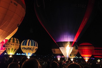
The background image fills the browser or device screen and there is a centered overlay with a heading, optional text and a CTA (Call To Action) style tab to dismiss it.
Splash Page
These pages are useful for drawing visitors attention to special promotions or events. Find out more about splash pages and how to use them by clicking the link below.
With over 60% of website visitors now using mobile devices like the iPhone and iPad it's not surprising that most people are familiar with the "hamburger" icon and the fact that clicking or tapping it will reveal the site navigation. It's quite common now to see "big name" websites where the designer has opted to eliminate the traditional navigation for desktop and laptop users and use the mobile style for all devices.
The flyout navigation uses a flexbox design to shoot the menu out horizontally when viewed on wider screens. On mobile devices it creates an overlay with vertical links.
In this example, the option to fix the navigation so that it is always in view has been turned on.


This example use the background image option in the wrapper.
The background image doesn't have to have top quality as it is mostly cover and disappears on tablets and phones to be replaced by the selected background color.
Vertical alignment of items in a CSS grid module layout uses the "align-self" property.
The options are "start" which aligns the item at the top, "center" for center align and "end" to align it at the bottom of the row. The "auto" value stretches the item to fill the row vertically.

CSS grid allows us to lay out items in a way that would be difficult or impossible using other methods.
If viewing this page on a computer, reduce the browser width to see how the items rearrange themselves. All this using a minimum of CSS and absolutely no javascript.