
Hero Animated Image
The hero image has been a "must have" item for many websites for quite a while. Rather then look like all the rest, it's a good idea to add a feature or two which makes the image unique.
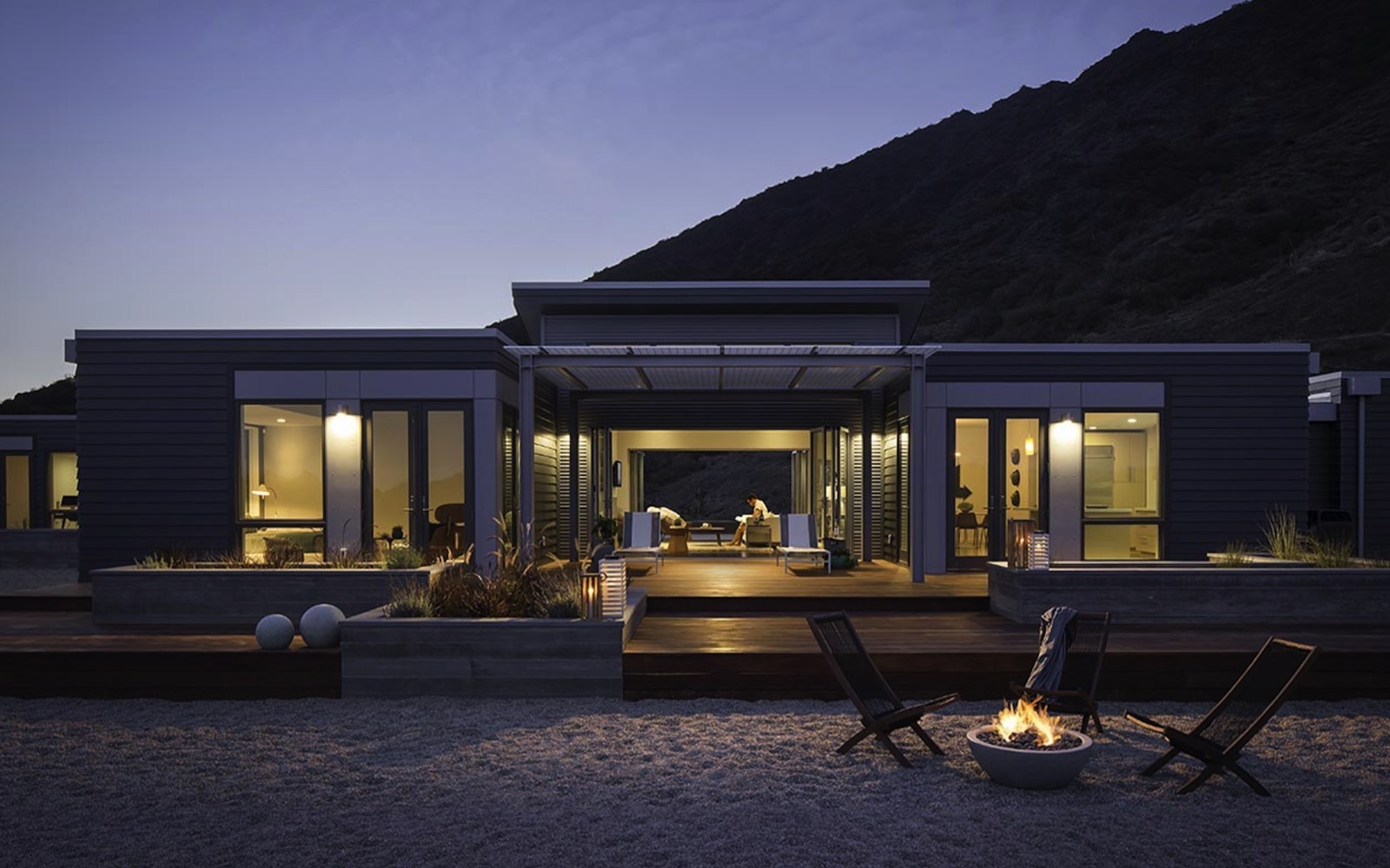
The Hero Switch Scale widget not only switches from fixed height above the break point to responsive below it but also has a scale animation. There is a choice of animation type and the iteration count can be set to a fixed number or infinity.
Images
Since the images are scaled up the actual image file needs to be large enough to give good quality so the image is inserted in three sizes - one for each device type. The images used in this demo are 1600 x 100px, 1200 x 750px and 800 x 500px respectively.
The images are inserted using the HTML5 picture element - rather than in the background - to allow the addition of alt text for the search engines and to enable them to be fully responsive on mobile devices for a better viewing experience.
Overlay
The overlay has controls for adjusting the color and its opacity and options to add a heading at the top and a CTA style link at the bottom.
The heading is at the top and can be aligned left, center or right and its position fine tuned using the controls for its position on the X and Y axis.
The link is centered at the bottom and can be configured to open internal or external pages with a new window option.
Animation
The animation options are none, ScaleIn, ScaleOut, ScaleInOut and ScaleOutIn. The animation time is the time it takes to complete one cycle and is set in seconds.
The scale amount is set using a slider and the iteration count can be set to a fixed amount between 1 and 5 or infinite.