ThemeKit Design
Elegant & responsive web design straight out of the box!
Break out of the responsive row and let your imagination run free.
Elegant & responsive web design straight out of the box!
Break out of the responsive row and let your imagination run free.
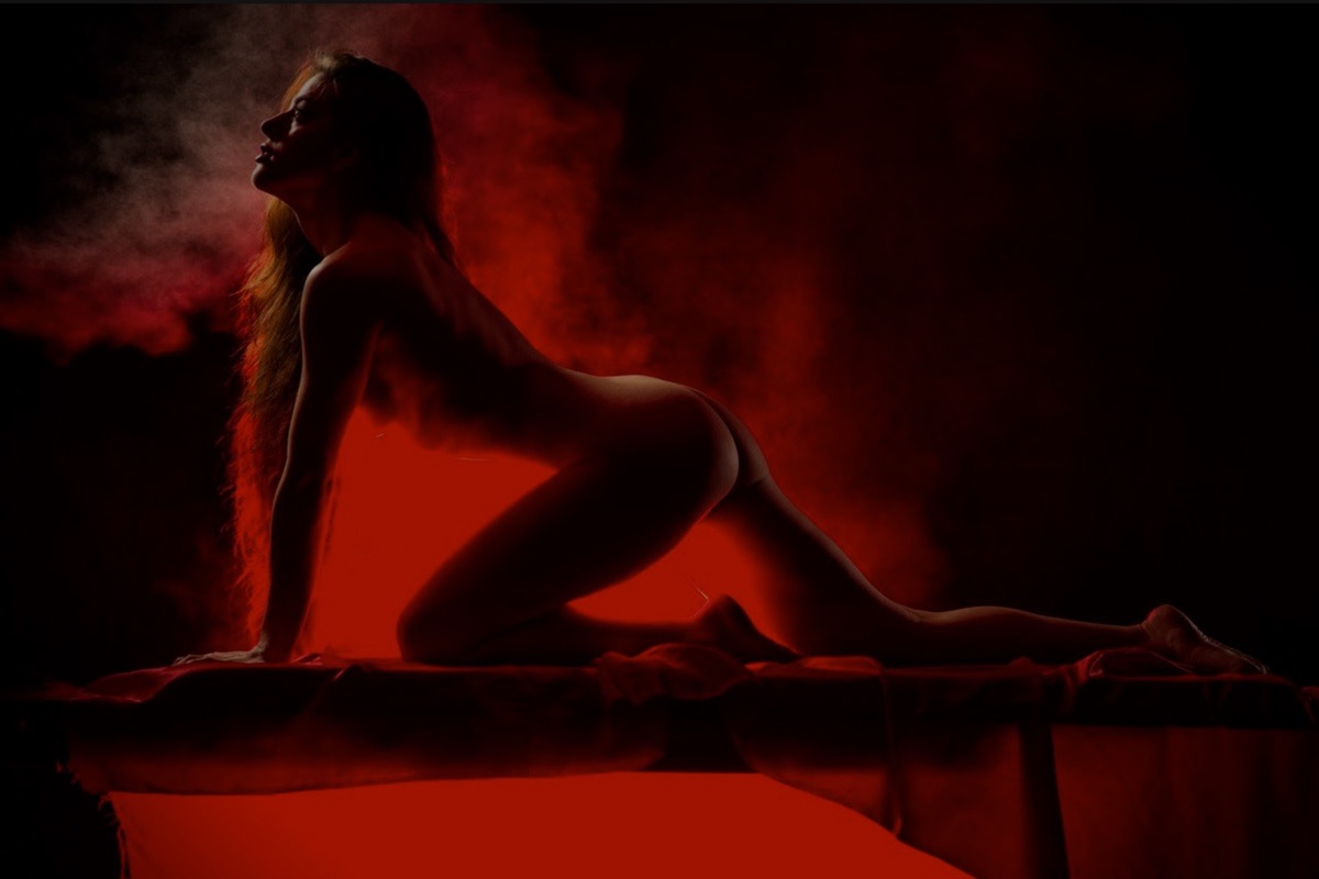
The hero item is normally full width with a fixed height. This works well on desktop browser but not so much for mobile users. Making the image responsive for tablet users gives a much better viewing experience.
A responsive image on a mobile phone would have very little height so the image aspect ratio needs to cahnge and the height increased to fill the screen.
Images
The images in the demo are sized at 1200 x 800px (78KB), 720 x 480px (36(KB) and the 9:16 aspect ratio image for phones is 375 x 667px with a file size of 30KB.
Switch
The container is an HTML5 <figure> element which has a 3 column, 3 row grid layout. Since a grid layout can't have auto height the image height is switched from pixels to viewport units and is expressed in vw. Using a with to set a height may seem a bit out of the ordinary but, if you think about you will evenyually see the sense in it.
Items
The first item is an h1 heading which is in row 1 column 1 and spans two columns. Next is a article element with a heading and text which is in crow 1, column 1 and spans all 3 columns to center it.
The optional link is in row 3, column 3 and is justified left to keep it in the picture.
At the first break point for tablets, all the items are set to column 1 and span all three columns to center and stack them one above the other.
Animation
The widget uses a small custom stylesheet to create 15 different animations to each item. There are separate controls for animation time and delay so that they can be staggered.
Poor navigation is one of the main reason why visitirs don't navigate beyond the ho,e page of a website. Using separate a navigation to open directories is much better and easier to grasp than using a two level navigation with directories. Adding images of what to expect when the link is clicked makes it much more likely that visitirs will browse other pages of the site.
Grid
The grid has an auto layout using the minmax function so that it adjusts the number of items per row based on the minimu width setting and the browser/device screen width. The spaing is adjusted using the value for the grid-gap selector.
Action Tab
The chameleon tab can be positioned at the top left or right and is fixed in position. The navigation appears below it with a fade or slide animation. When there are a lot of links and it is viewed on phones, the navigation has a max height and any overflow will scroll.
Animation
To add some excitement for those who need motion, the images can have a scale on hover animation. The captions can animate in on hover and can be positioned at the top, center or bottom.