ThemeKit Reveal

Reveal Hero Switch

Hero Switch

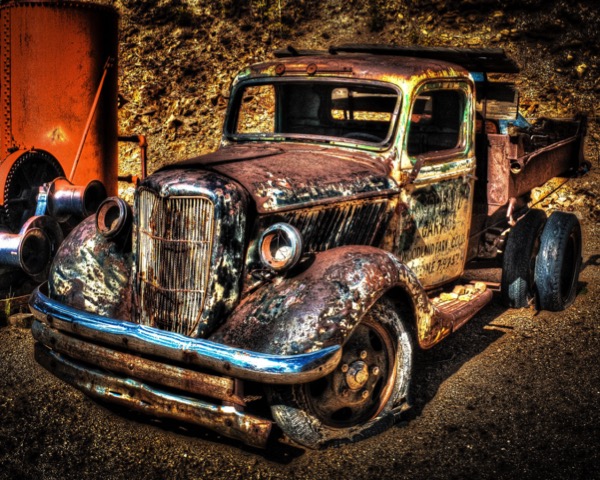
The image is full width, fixed height when viewed on computers. On tablets and phones it becomes fully responsive.
Images
The image is inserted in two sizes. The larger image in the demo is 1200 x 720px and the smaller one is 720 x 480px. The switch to fully responsive mode requires the use of an intrinsic ratio so the width and height of one of the image files needs to be inserted in the widget settings.
Animation
The two parts of the image animate in left and right. The caption animates in up and the link icon if present animates in and down.
Angle
The angle at which the left and right images meet can be varied from approximately 45° left through vertical to 45° right using a slider.
Break Point
The break point is set for tablets in landscape mode where the smaller image is displayed as fully responsive.
Link
The image can be configured as an internal or external link. The link icon inherits the font color and background color from the caption.

Page Open Animation
Optional Caption

Page Open Animation

The two column grid has a <figure> with an image, alt text and optional caption and an <article> with a heading, text and optional link. The items can switch position if required.

Info

Open Page

The two column grid has an image and a text block whose positions can be switched if required. They swing into view from the center outwards
Items
The image can have a caption which can show on hover when viewed on computers. The text section is centered vertically and the kink can be aligned left center or right and open internal or external pages.
The items can have a borer and/or a bottom box shadow.
Container
The container has controls for top/bottom and left/right spacing. When items have perspective they tend to break out of the container. The vertical spacing control can be adjusted so that the animated items stay within their container.
Animation
The container has perspective and each item uses an animation where the keyframes change the rotation on the Y-axis. The transform origin is set to right for the left item and left for the right item to give the opening of a book effect.
Break Point
The break point is set for mobile phones in landscape mode where the text moves below the image and the animation is removed.