ThemeKit Reveal
Zoom Header
Info
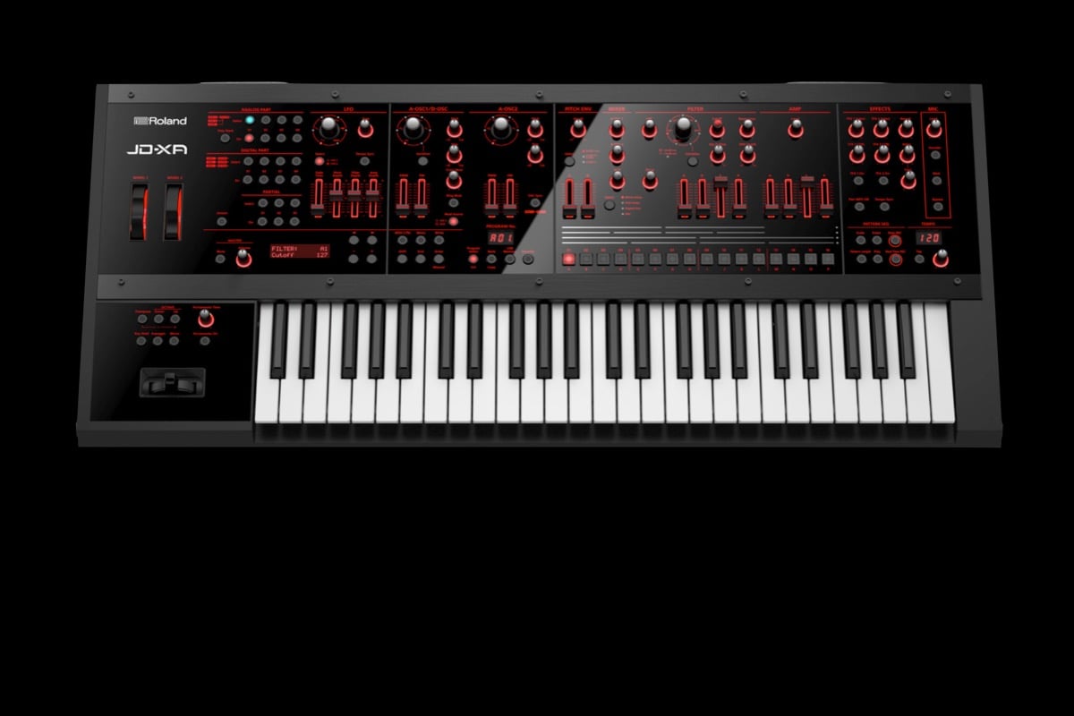
The responsive image zooms up on scroll down. It has an optional animated overlay and an <article> with a heading, text and an optional link.
This is a much better effect to use on a responsive page than parallax which really isn't suitable for use on pages that will be viewed on mobile phones.
Images
The image is inserted in two sizes. The large image in the demo is 1200 x 600px and the mobile image is half that size. The images were optimised before importing into EverWeb to reduce their file sizes to 66KB and 25 KB respectively.
Aspect Ratio
To make the images responsive in this scenario an intrinic aspect ratio is used to replace the height of the container, images and the overlay. Obviously both the large and mobile images must have the same aspect ratio and the width and height of one of the images must be entered into the boxes provided in the widget settings panel.
Zoom
The zoom effect is created using a tiny jQuery plugin and is variable using a slider. A setting of zero negates the effect. The amount of zoom varies fro maximum at a setting of 1 and minimum at 20 since it is an inverse proportion.
Article
The overlay has a two column grid layout and the article can be aligned left center or right and top, center or bottom within the grid. On screen widths below the break point the article becomes centered horizontally.
Link
The optional link can open internal or external pages and has a new window option. It can be styled as a text link or, as shown in the example, a CTA (Call To Action) with a contrasting background and/or a border.
The ThemeKit Reveal Heading has quite a few options apart from the animation. It can function has main h1 heading, a page name h2 heading or a page section h3 heading.
Other options are to show a scroll down chevron icon and to use it to scroll to an anchor.
Anchor
When the widget is used as an h3 section heading it can be configured as an anchor like the one immediately above. The smooth scroll down function is triggered by clicking the chevron icon in the h2 heading further up the page.
Layout
The container in which heading and scroll down icon are inserted has a two column grid layout and is centered with a maximum width setting.
The heading spans both columns and the icon is in column two. The heading itself can be aligned left or center.
Heading Animation
The heading can animate in down, right, up or left when it enters the viewport. It can be set to occur once or every time the heading enters the viewport.
By default the animation is turned off for mobile phones. It can be turned on for these devices if required by checking a box.
Background
The background can have a two color gradient with adjustable gradient angle. The effect is created by switching the background colors to and fro over time. The effect can be varied by changing the angle and the animation time.
Like the heading, the background animation is turned off for mobile phones and can be turned on for these devices if required by checking a box.