Custom Class Styles
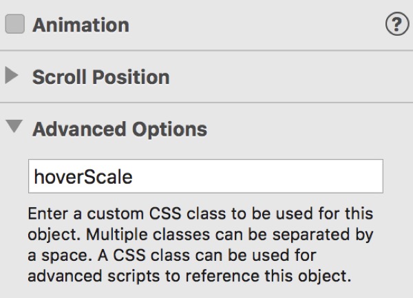
The styles for creating the scale on hover are shown below and are pasted into the Head Code box in the Page inspector.
<style>
.hoverScale img{transition:all 350ms ease-in-out;transform:scale(1)}
.hoverScale img:hover{transition:all 700ms ease-in-out;transform:scale(1.22)}
</style>
Note that styles pasted into the Head Code box must be inserted between opening and closing <style></style> tags,
The item has a scale value of 1 on page load and 1.25 on hover. The scale value in the code is marked in red.
Transitions
Hovers without animation make a web page design look dated.
The CSS property which is animated is "all".
The transition time is set in milliseconds.
The transition timimg function is set to "ease-in-out"
The animation IN time is on the hover and the OUT time is on the item itself as can be seen from the code above. For best results set the animation IN time to twice that of the OUT time.
Transform
The scale is set using a CSS transition property set to a value of "scale" with the scale amount in parentheses (round brackets).