
Lightbox Slider
A standard slide show isn't much use for a blog since all the images will compromise the download speed.
The thumbnail image's icon can open either one large image or a slideshow.
The thumbnail image can be positioned left or right.
A blog post with too many images can put visitors off and distract them from reading the content. The absolute worst thing you can put on a blog page is an autoplaying slideshow. Not only is it extremely irritating if you are trying to read the text but it causes really poor download performance - especially on mobile devices - and uses up unecessary battery power.
A simple lightbox slideshow can be the best way to display either one larger image or a whole bunch of them. Only the thumbnail image needs to download with the rest of the page content. The large images don't need to download until the visitor selects them.
Container
The container has two grid columns - one with the image and the other with text. The items are vertically centered in the container and their positions can be switched if required. On narrower screens the text is positioned below the image.
Column Widths
The proportions of the two columns can be adjusted by changing the value for the number of fractional units they span. This may sound complicated but it couldn't be simpler.
If both columns are to be equal, set the column widths at 1. Other values will give different proportions. For example, the item on this page has the left column set to 3fr and the right column to 2fr. This makes the image occupy 3/5 of the widthor 60% and the text section 2/5 or 40%.
Image
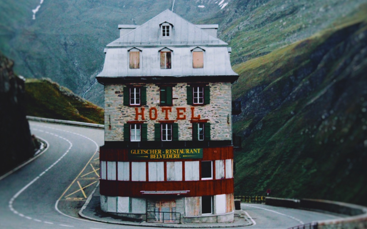
The image has an optional caption with adjustable background opacity which can describe the slideshow content and be a hint to those who don't know what the icon at the top right signifies.
The icon is an SVG so its color and hover color can be adjusted. Clicking or tapping it will open the lightbox image or slideshow.
Slideshow
The lightbox slideshow is responive and will display images up to their file width. An image size of 1200px is wide enough for most puposes.
The slideshow is navigated using directional arrows which can be hidden on touch devices where the slides can be swiped. The slides have captions and there is a slide counter.