
Blog Photos

Blog Photo Post
Lazy Loading Images

Lazy Load Blog Photo Post

The smaller the size of the image - the faster the page will download. An image large enough to display on a computer with decent quality is really too big for downloading on mobile phones. To save loading different sizes for the different devices, the image percentage image width can be reduce for wider brower settings and screens.
This container is set to 1200px max width but the image's width is set to 75% so the image size can be reduced to 800px wide and give the same quality and faster download.
Lazy Loading
Normally, when a web page downloads in the browser, all the images have to download at once even if they are not in view. Lazy loading is a method of delaying the download of images that are not in the viewport. More images are loaded as the page is scrolled just before they appear in view.
Employing a lazy load script makes a huge difference to the page download time and should be considered if the page has more than two or three images..

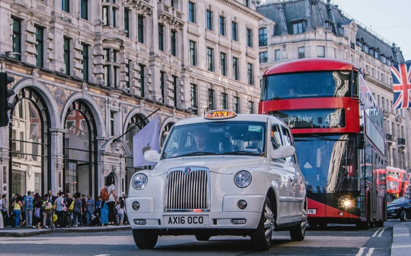
Blog Photo Post
Lazy Loading Images

Lazy Load Blog Photo Post

April 15th 2019

The RGL Blog Photo Post widget featured here has an image with alt text and an optional overlay caption, a heading, text, optional date field and on open link. Lots of these can be stacked on a page since only the first one or two will be in the viewport when the page is loaded and the rest will download as the visitor scrolls the page.
Image
As mentioned previously, the image should be cropped to the maximum size that it will appear in the browser before importing into EverWeb. In this case the image is 800px wide which is large enough and not too big for downloading on mobile devices.
The image has an alt text attribute for entering keywords for the search engines. It is really important to think carefully about using keywords in a blog since vistors often search for images rather than text content.
Figcaption
The image is inserted in an HTML5 <figure> element with a caption in the <figcaption> element. Using this setup ensures that the search engines know the caption is related to the image and just some round piece of text.
The caption inherits the widget's font family and has its own controls for font size, color and for the background color and its opacity.
Styles
The image has controld for border width, color and radius and box shadow radius and color. Using the top/bottom and left/right padding controls, it can be either the full width of the container or padded in to allow room for a box shadow.

Blog Photo Post
Text Content

Text Content

The text area is inserted in an HTML5 <article> element. It has a heading, optional date field, text and an optional link.
The font can be web safe or non web safe or Google hosted with a web safe fallback. The font use here is the Google hosted "Stint Ultra Expanded".
The heading has controls for font size and can be aligned left, center or right.
The text has controls for font size, text align and line height The date field has controls for font size and color and there another couple of controls for styling spans.
Link
Creating images as a hyperlink is not the best of ideas on responsive page because touch device users have no way of knowing that the image is a link. The widget has a CTA block style link which is much more useful and easier to follow.
The link can open internal or external pages and in a new window if required. There are controls for font size, color, background, hover color, border with color and radius and for aligning the link left, center or right.
Flip
There may be occasions when the image should sit below the text so there is a control that moves the text content section above it by checking a box.

Blog Entries List

© EverWeb Widgets -