Universal Audio Arrow
Arrow is the world’s first Thunderbolt 3-powered desktop recording audio interface for Mac and Windows …
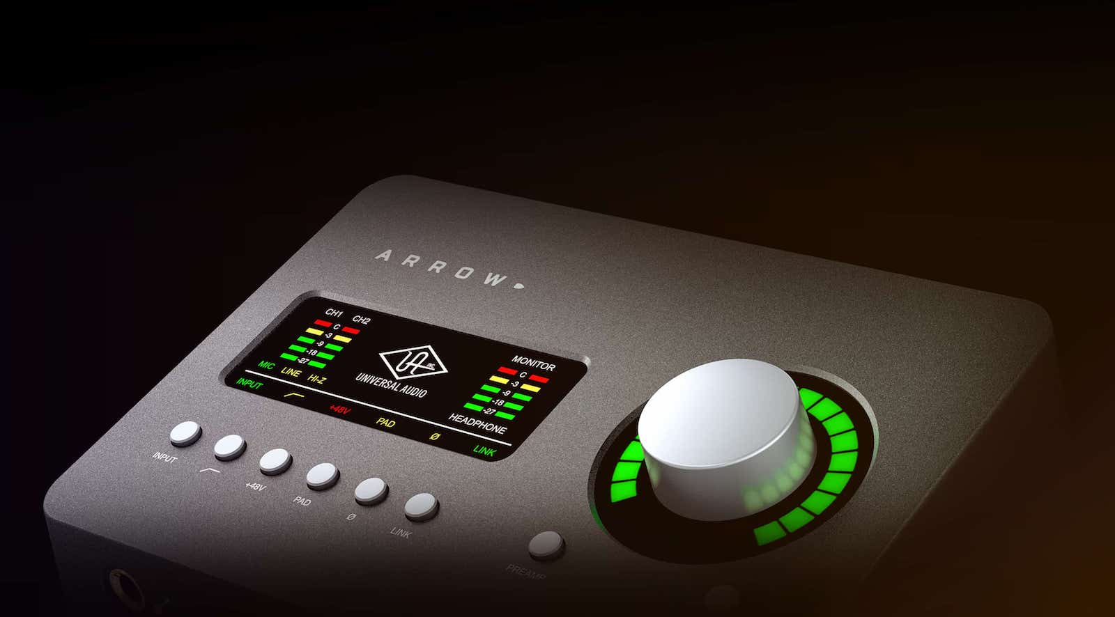
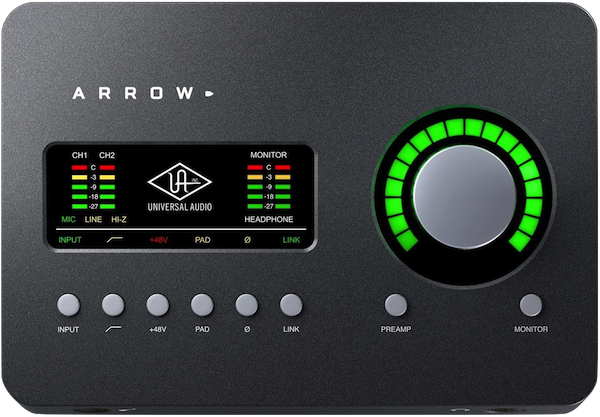
Arrow is the world’s first Thunderbolt 3-powered desktop recording audio interface for Mac and Windows …
The banner has a full width, fixed height background image with a smaller image to the left and an info block to the right.
The small image and the info text can fade in on page load. Each has a control for setting the delay and animation times.
On mobile phones, the layout switches so that the info sits below the small image.
There are two height settings - one for the banner when viewed on computers and tablets and another for mobile phones where more height may be required when the small image and info block are stacked.
Background Images
Three different images are required for each device type - computer, tablet and mobile phone. The image files should be reduced in size before importing into EverWeb. The images used in this demo is 1600px, 1200px and 800px respectively.
Small Image
The small image has controls for setting the maximum width on computers and tablets, the percentage width on mobile phones and its percentage distance from the top on phones.
It can have a contrasting border if required.
Info Module
This has a heading and text and an optional CTA style link which can be configured to open an internal or external page and in a new windw if required.
The module has controls for setting the maximum width on computers and tablets and the maximum width on phones. There is a control for setting its percentage distance from the top on phones when it sits below the image.
The text can use a web safe font or a non websafe or Google hosted font with a web safe fallback.
The are controls for font size, color, line height background color and its opacity and overall padding.
The optional link has controls for font size, color, hover color and border width and radius.
Animation
There is a check box to turn on the fade in animation and controls for setting the animation delay and time for both the small image and the info module.
The info bar is full width and has options for a phone number, smooth scroll down and an email link. It is design to be placed below large items. The icons are created using SVG code which is embeded in the HTML so there are no images to download.
Phone
On computers and tablets, the phone number is displayed. When the page is viewed on a mobile phone, the number is replaced by a phone button icon so that the number can be dialed.
Scroll Down
The smooth scroll link uses a chevron down icon. It should be used in conjunction with the Responsive Anchor Spacer widget which is in the Responsive Links pack.
Email
The email link opens the vistor's email client and has fields for the email address, subject and content.
Position
The info bar can be placed directly below an item. By checking a box, it can move up to overlay the bottom of the item above it as shown in the above example.
Animation
The info bar can animate in on page load and has controls for setting the animation time and delay in seconds.