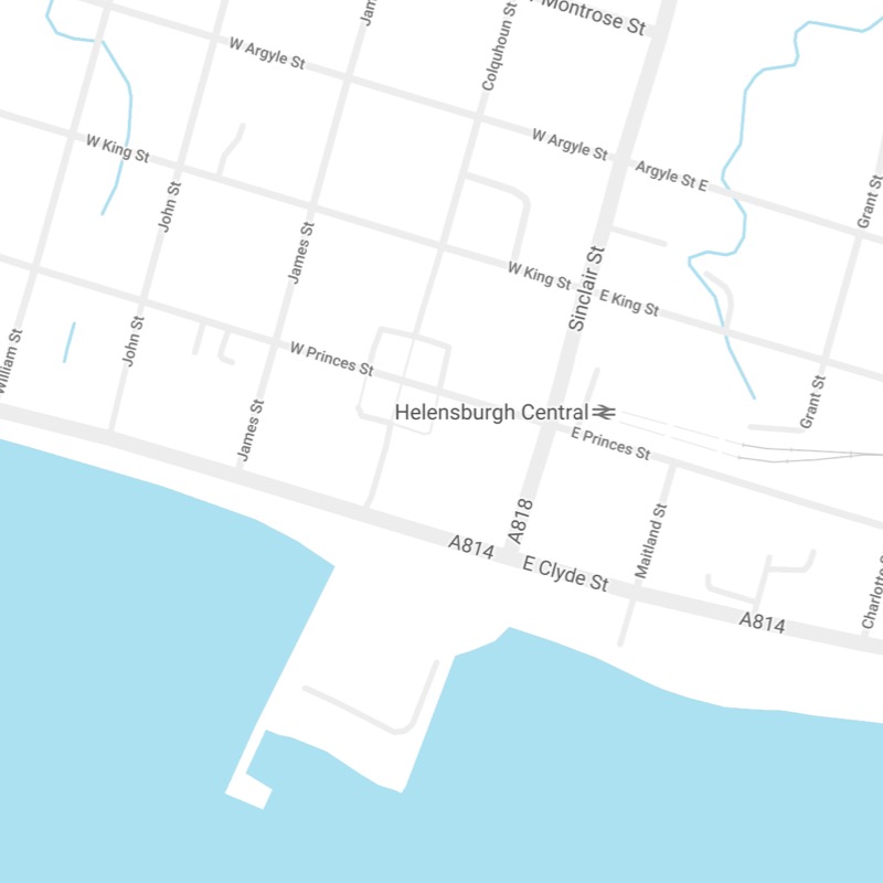
ThemeKit RE Contact Module
99 West Clyde Way
Helensburgh G88 7BC
99 West Clyde Way
Helensburgh G88 7BC

If visitors can't find the contact info really easily they will immediately distrust the site and go elsewhere.
The contact email function and phone number if applicable must be visible when the landing page loads - not hidden away in one of those ugly gigantic footers.
Email
The email function is the number one way that prospective customers will get in touch. It must be clearly visible and be present near the top and the bottom of the page.
Phone
If sales are made by phone or customers are encouraged to call to order items the phone number/phone call function should be at or near the top of the page and repeated at the bottom if there is no back to the top function.
Contact Forms
Contact forms are the least desirable method of contact. Most visitors detest them and avoid them if possible.
If a contact form is essential it should have the very minimum of fields, no checkboxes or drop down menus when viewed on phones and no reCaptcha.
If reCaptcha is required for confidential info, use a different form from the general contact one which only needs fields for name, email, optional phone and a comments box.
Form Design
Visitors may overcome their aversion to filling out a form if it is minimal and well designed. Forms with placeholder text instead of labels and no nasty borders around the form fields which are really outdated.
The ThemeKit RE Scale Navigation has a horizontal orientation on browser/screen widths above the breakpoint for those who still think this is the best way!
It has an optional scale width bottom shadow animation to add a touch of class.
Below the break point the action tab appears at the bottom of the screen to make life easier for those using tablets and phones.