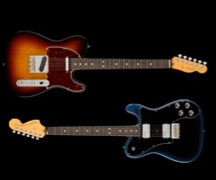
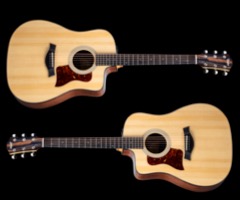
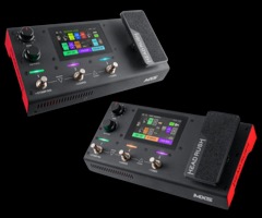
ThemeKit eCommerce

Product [3]

ThemeKit eCom Card Slider 1
Behringer X-Touch
ThemeKit eCom Card Slider 3
Angled Left
ThemeKit eCom Card Slider 3
Angled Right
ThemeKit eCom Card Slider 4
Back View
ThemeKit eCom Card Slider 5
8 Channel
Optional Extender

Card Slider

£ 499

The overlap is created using a background linear gradient with a color to the left and transparency to the right.
Adjusting the percentage width of the transparent section adusts the overlap.
The height of the slider in relation to the text area is reduced using the "Vertical Inset" slider.
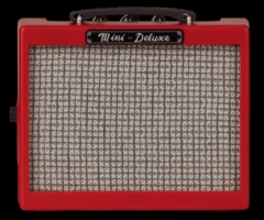
Action Tab
The action tab has the choice of a bag, basket or cart icon - eiither black or white.

Add To Cart

eCom Drawer

The drawer animation works in conjunciton with the eCom Action Bar widget by inserting the same ID number in the drawer and the article's Drawer ID field.
Content
This content section can be full width or the layout can be switched to two columns with a list in the second column.

TEST

    List

  • Add up to 48 list items
  • List style types are disc, circle, square, none, decimal, decimal-leading-zero, lower-alpha and upper-alpha
  • Ajsuts list item inset
  • Adlust list item font size and line height
  • Adjust list item spacing

Carousel/Lightbox Gallery

A carousel is a much better option for showing product images than a slideshow since it only requires small image files which can be lazy loaded for fast page download.
The number of images to show and to scroll per click can be set for each device type.
The previous/next action tabs can be hidden on mobile devices at a preselescted breakpoint and the carousel can be swiped.

Gallery

A lightbox gallery launched from a thumbnail grid tkes up too much space on an eCommerce website when it is viewed on mobile devices.
The carousel images are links to a responsive lightbox gallery with all the required options for seting up images with varying aspect ratio.
The gallery caption shares the carousel's font family but has its own controls for setting the font size and the color of the captions, close icon and action tab icons.
Captions can overlay at the top or bottom of the image or be inserted below and outside the image.
The lightbox overlay has controls for setting the background color and its opacity.

Scroll Snap

One of the most usefull features on a product page is image links to similar items which may persuade a visitor to consider another item if the one on display is not ideal.
The scroller uses CSS3 scroll snap instead of relying on Javascript. Most visitors are used to horizontal scrolling using the mouse or track pad on computers and laptops and the images swipe in the usual fashion on touch devuces,
The scroller is full width, has an option alheading and the number of items to show can be set for each device type.
The images have alt text and a caption and can be configured as hyperlinks. The link icon and rhe caption can show on hover on computers if required.

Scrollbars

The horizontal scrollbar can be hidden if required. For webkit browsers - Chrome & Safari - the scrollbar can be styled with controls for the scrollbar height, track color and the thumb color.

View Cart

It is usefull to have a show cart function in a fixed position so that it is always in view.
The ThemeKit eCom Show Cart widget shows a basket, bag or cart SVG icon which has adjustable size.
Position
The tab can be position relative to the top or bottom and left or right. The values for positio X and Y can be adjusted.
Animation
The optional animation has controls for the animation duration set in milliseconds and the delat which is set in seconds.
The tab inimates in on the X-axis from the direction selected for the tab's position - left or right.

View Cart

List Modal

The list modal is opened from the ThemeKit eCom Action Bar. It can be used to display an item's specifications or a list of instructions for its use.
The modal has a heading, text block and a styled list.

  • The list can be in view for editing on the EverWeb design canvas by using the editing height control
  • The list can have up to 48 items
  • When the list exceeds the viewing device's viewport height any overflow will scroll into view
  • The list style types available are disc, circle, square, none, decimal, decimal-leading-zero, lower-alpha and upper-alpha
  • There are controls for list font size, list item inset, list item line height and for the list item vertical spacing
  • The container has options to add a border and/or a box shadow
  • The modal overlay has controls for the background color and its opacity