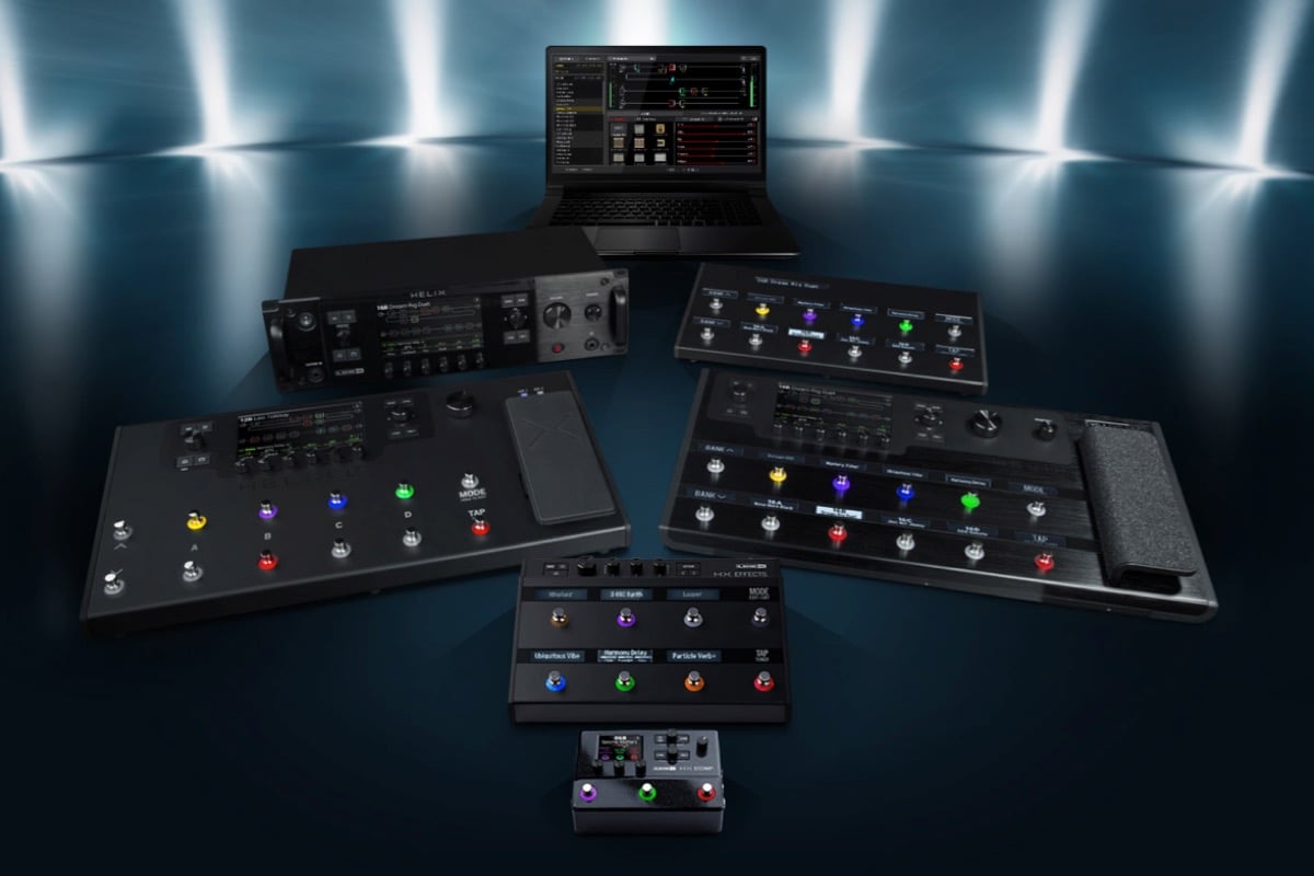
ThemeKit Float SU Hero
Slide over images below
Info
The images above are inserted below the ThemeKit Float Slide Up Hero widget. The widget can display either one or two images with captions and optional links. When two images are inserted the right hand one appears below the left on screen widths below the break point.
Links
The optional links are indicated by a link icon at the top right. The icon can appear on hover when viewed on computers.
Animation
The slide up animation has a control for adjusting the offset on page load and each image has its own controls for animation time and delay.
A grid layout row with two or three items.
When three items are present the last one centers itself in row two below the break point.
Heading
The links are optional and can open internal or external pages with a new window option.
Each item is an HTML5 <article> and also has a grid layout with three rows for the header, text and the optional link.
Auto Height
The items all stretch to the same height despite having varying amounts of content.
The heading is in a <header> followed by an optional SVG icon, the text in a <div> and a link in the last row.
Rows
The top and bottom row are set to "auto" and the middle one is set to 1fr (fractional unit).
The third item is optional and is showm here without the link.
The row has a grid layout with two or three columns and three rows. When three items are present the last one centers itself below the first two on screen widths below the break point. On mobile phones they stack vertically.
Item Layout
The heading is in an HTML5 <header> and has its own controls for font size, color, align and for the background color and its opacity.
The text section is in row two and has the optional icons and the text with styling options for spans.
The optional link is in row 3 and has controls for font size, color, background and hover background.
The item is an HTML5 <article> with a heading, text and an optional link which floats in from the left when it appears in the viewport so that everybody notices it!
Animation
The animation can occur every time the item enters the viewport or only once. The animation is turned off by default for mobile phones but can be turned on by checking a box if required.
Link
The link can be styled as a CTA (Call To Action) with a border or a contrasting background color.
The link can be configured to open an internal or an external page and has a new window option. It can be aligned left, center or right.