ThemeKit Float Hero
Animate on scroll hero image with optional bottom shadow
More …
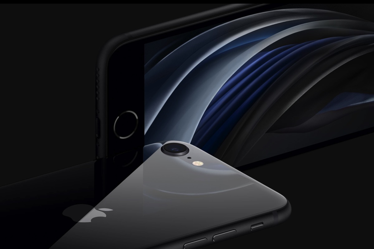
The ThemeKit Float Hero is full width, fixed height and inserts the image in three sizes for the varoius devices. It has an overlay with a two column layout which has an opacity slider and can aniate in at page load.
Text
The text section has a maximum width setting and can be inserted in column one, column two or to span both columns when viewed on browser/screen widths above the break point. It becomes centered below the break point.
There is a heading, text and an optional link which can open internal/external pages and has a new window option.
Animation
In this cas the hero rotates out/in on the X-axis as the page is scrolled.
The scroll box has an image and alt text in a <figure> element and a heading, optional span, text and an optional link in an <article> element.
Widgets
The effect can be initiated on exit, on load or on exit. Most effects would be on load except for the first and last items on the page.
To prevent over animating page items both the image and text have checkboxes to turn them on/off.
The container has a CSS grid layout which encloses two HTML5 <article> elements.
Content
Each article has an optional icon, a heading, text and a CTA style link tab which can open internal or external pages and has a new window option.
Spans
Spans have their own controls for font size and color.
Note how the relative widths of the columns can be adjusted to suit the amount of text content and how the links line up at the bottom.
Mobile Layout
On screen widths below the break point the right column sits below the left.
Using the EverWeb default method to insert an image in the browser background is NOT recommended for responsive deisgns. The size of the image required to give decent quality on computers would be way to large to download on mobile devices.
The background image on this page is inserted in three sizes for the various devices using the ThemeKit Float BG Image widget.
Rather than fill the whole of the browser background it has a fixed position and is set to the heght of the viewport rather than the whole browser. This method allows much faster load time and greatly improved image quality.
Images
The images used on this page are sized at 1200 x 960px, 600 x 480px and a 9:16 aspect ratio image for phones in portrait mode at 375 x 667px.
The ThemeKit Float Nav slides up on click from a tab positioned at the bottom center of the browser/device window to make it more convenient for visitors using mobile touch devices.
Tab
The tab has controls for icon color, background color and opacity, padding and top border radius. It can be animated by checking a box and setting the animation time and delay in seconds.
Links
The links have controls for font, web safe fallback font, size, color, hover color, background color and its opacity and vertical spacing.
The link container has controls for adding a border and/or a box shadow.
Setup
The links can be seen on the EverWeb design canvas during setup and are then hidden by checking a box prior to publishing the page.
Overflow
The navigation can have any amount of links which may make it too high to view all the links on phones. In this case the container will fill the height of the device window and any overflow will scroll.
The ThemeKit Float Header has a logo configured as an internal link, an h1 heading and an option to sjow a phone number that switches to a phone icon to place the call on tap when viewed on mobile phones.