Gradient Grid Header
This <article> element has a heading, text and a CTA style link
Call To Action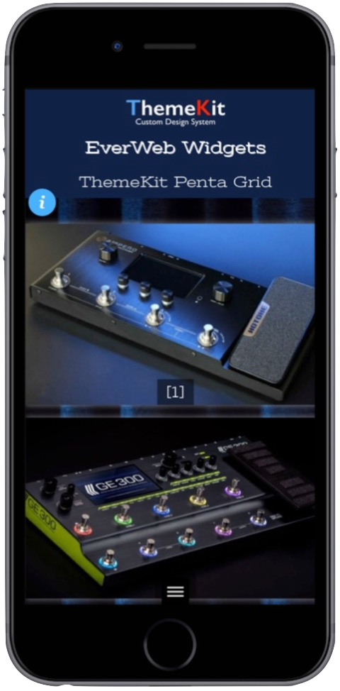
This <article> element has a heading, text and a CTA style link
Call To Action
This <figure> background is translated off axis to create the background block effect.
Product Slider![Grid Offset Block [1]](ewExternalFiles/texture-720.jpg)
Alternate blocks are switched by changing the nth-of-type selector on each element between "odd" or "even".
Stage Slider![Grid Offset Block [2]](ewExternalFiles/transit.jpg)
This type of header is being seen more often now that desgners are embracing the CSS Grid Layout Module.
The container has a top and bottom panel. The top panel can have a gradient backgrund and the bottom panel has an adjustable angle - left or right.
The main heading is in the top panel and the article with heading, text and optional CTA link is in the bottom one.
On browser/screen widths above the break point the image is in column two and overlaps both rows.
On screen widths below the break point the heading an image are in row one and the article in row two.
On mobile phones in portrait mode the items stack vertically.
Background Option
If the two tone background is not required, reduce the bottom panel's background color opacity slider to zero to reveal the gradient background set for the top panel.
Logo
The optional logo/link is inserted at the top left and has controls for width and padding. The links i configured as an internal one - usually to the home page.
When the logo is inserted, the main heading has a control to move itself down the page clear of the logo when viewed on phones in portrait mode.
Image Animation
The animation is created using the ThemeKit Custom Animation stylesheet with a choice of 15 types and controls for animation time and delay set in seconds.