ThemeKit Modal Jumbotron
Modal OptionThe Jumbotron is used to draw attention to an important item, a new product or service or specual offer.
Options for a modal action tab and an internal link.
The Jumbotron is used to draw attention to an important item, a new product or service or specual offer.
Options for a modal action tab and an internal link.
A Jumbotron is used to draw attention to an important item or a special offer. The version above is used to instead of a hero item and shows the background gradient version with the optional front image and an info article.
Both the article and the image have border and box shadow style controls. Their positions can be switched and the text can appear above or below the image on device screen widths less than the breakpoint setting.
The modal function can be set to open any of the ThemeKit Modals by turning it on and entering the modal ID number.
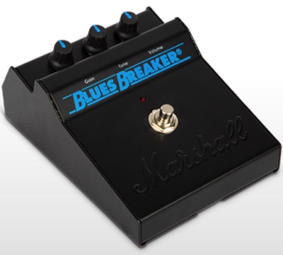
The sound of the 90s original "Bluesbreaker" became a legend, with its smooth tone, rich warmth and full character.
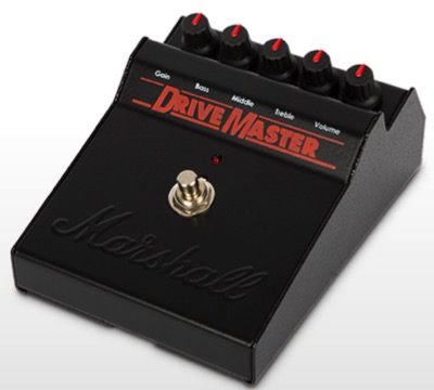
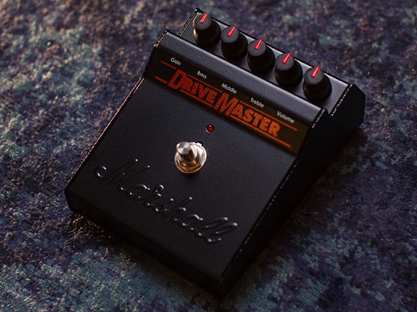
The Drivemaster is based on the original Guv’nor but takes things a stage further with a new tone and drive network.
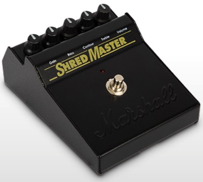
The Shredmaster has become synonymous with game-changing music throughout the 90s and beyond.
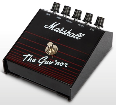
The original Guv’nor pedal was released in 1988 and set the bar for the generations of distortion pedals that have followed since.
Both the ThemeKit Modal Media Row and the ThemeKit Modal Icon Row have the same features other than the lazy loading inages in the media row are replaced by SVG icons in the icon version.
Dual Function
Both of these widgets can be used as normal rows by switching the modal action tab to be configured as an internal/external link.
Even without the modal function they provide a much better alternative to creating rows using the EverWeb responsive row feature.
The items use the CSS Grid Layout Module to create a responsive row with 2, 3 or 4 items.
When there are three columns the last one is centeredin row 2 below the break point.
Each item is an <article> element which can have a border and/or a bottom box shadow.
There is an SVG icon, heading, text and an action tab to open the modal to show more content.
The icons are SVGs and have controls for icon size, color, background, padding, border width, colorant radius.
The icons can be made round by checking a box.
This exampleof the Content Modal excludes the optional image and shows the main heading and text, the optional list and the optional second heading and text.
The list describes the various modal types …
The modals were designed for the maximum efficiency and fast download on mobile devices. They use a common stylesheet to cut down on the amount of internal styles.
The media files - images & video - are either lazy loaded by default or have a lazy load option.
The spec list has a two column grid layout with a fixed width for the first column and the option for zebra striping alternate rows.
Form Factor
Robust Metal ChassisCompatibility
Mac/WindowsInput Channels
3 x sourcesOutput Channels
2 x stereo monitorsAnalogue Inputs
2 x 1/4" TRS (line), 2 x XLR-1/4" combo (mic), 1 x 1/8" (aux in)Analogue Outputs
4 x 1/4" (monitors A/B), 2 x 1/4" (2-track)Headphones
2 x 1/4" stereo outputsADAT I/O
8 additional inputs and 8 additional outputs, up to 96kHzTalkback
Built in microphoneA/D Resolution
Up to 24-bit/192kHzSoftware
Powerful Audio Control Center software & Creative SuitePower Supply
18V DC external switching power supply (included)


