The ThemeKit Text Poster Heading widget creates an h1 through h3 heading with responcive text size using viewport units for the font size, top/bottom padding and letter spacing.
The font used in the example is the Google hosted Rubik Mono One. The text has a three color gradient color and controls for text stroke and color.
Each color in the gradient has a slider for adjusting the color stop to create the required color overlaps.
EverWeb Widgets
ThemeKit Text
TMark Wrap
Wrapping text around a heading comes from out of the box thinking and doesn't seem to be a "thing" in web design. A Google search reveals no results except for wrapping text around an image which is covered in excruciating detail by all those long winded "webbie teachers".
Text Wrap Text
It turns out to be quite a usefull feature and can be used instead of a drop cap without its limitations.
Since this is an "out-of-the-box" item there is no default HTML element so the <mark> has been pressed into service and styled appropriately. It works OK and is semantic since it is used to highlight a number or text.
Text Mark
The article has an optional main heading and a text area with a focus element and text.
The element can contain a letter or a number or text and has its own controls for font size, color and background.
The element used here is a <mark> floated left so that the text wraps around it.
Mark
The HTML <mark> is used where text needs to be highlighted or marked to draw attention to it.
The browsers generate a mark with no styles except for black text and a yelow background. The ThemeKit Text Mark widget adds more style with controls for font sie, weight, style, line height, color, border-radius, background color and its opacity, outset and padding.
Link
The optional link can be configured to open internal or external pages and has a background hover animation on computers.
Auto Columns

Text Content [1]
Blocks of text should have a maximum width of not much more than about 800px. Any wider and it becomes difficult for the eye to find the begining of the next line. One solution is to use auto columns.
Columns
Multiple column properties are a lot more efficient now that prefixes are not required by the major browsers.
The properties used here are column-count, column-gap and column-rule width, style and color.
In this example the column rule is 1px wide, solid with a light grey color so that it isn't too prominent
Media Queries
The number of columns displayed can be set for computer, tablet landscape, tablet portrait and phone in portrait mode.
Images
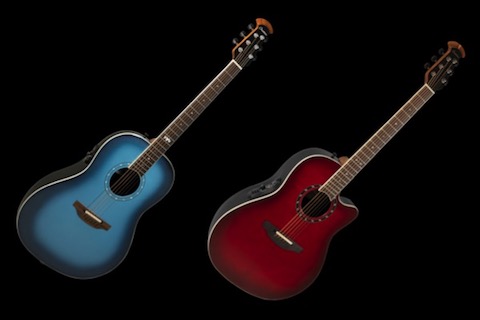
The images in this example are inserted inline inside the paragraph element and fill the column width.
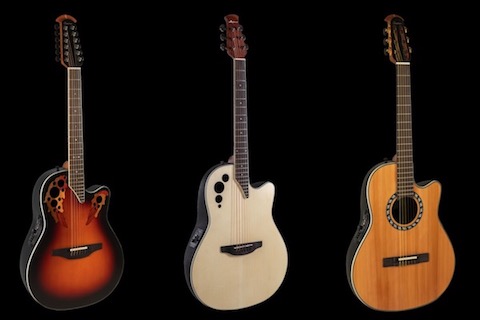
The second image and its related text content is inserted in a secong paragraph element.
Using columns allows the image file size to be really small.

Text Content [2]
Text links should be avoided when designing responsive web pages since they are not user friendly when viewed on mobile devoces.
Any links relating to the text comtemt should be inserted as CTAs (call to action) below the text.