Info A
This is an example of how several unequal size items can be displayed using CSS grid layout.
The Google hosted font used here is Stint Ultra Expanded.
This is an example of how several unequal size items can be displayed using CSS grid layout.
The Google hosted font used here is Stint Ultra Expanded.
Items are positioned in rows and columns, set to "align-self:center" to align them vertically and respositioned for tablet and phone using media queries.

All items are set to "align-self:start"
The optional link can be configured to open internal pages and can be aligned left, center or right
The item positioning below the break point inserts the image and text in the same row and places one image left and the other right.

The Responsive Grid Layout Module is more versatile than the Flexbox layout used by the EverWeb default Responsive Row widget. Flex layout positions items in rows whereas Grid layout positions them in rows and columns.
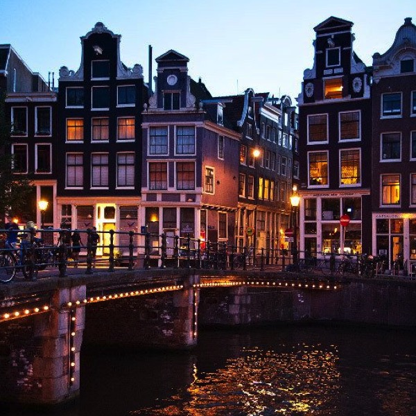
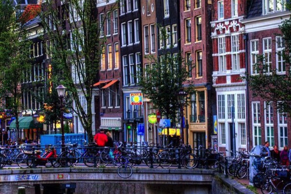
The example on this page has two images and two HTML5 article elements with the images on the left and right and the articles stacked in the center.
The first example has the items "align-self:center" and the second one has "align-self:start". The break point is set to change the layout when the page is viewed on a tablet in landscape mode. If viewing this page on a computer, reduce the browser width to see the differences in the layouts or open this page in the iOS Simulator.