Image Text Row
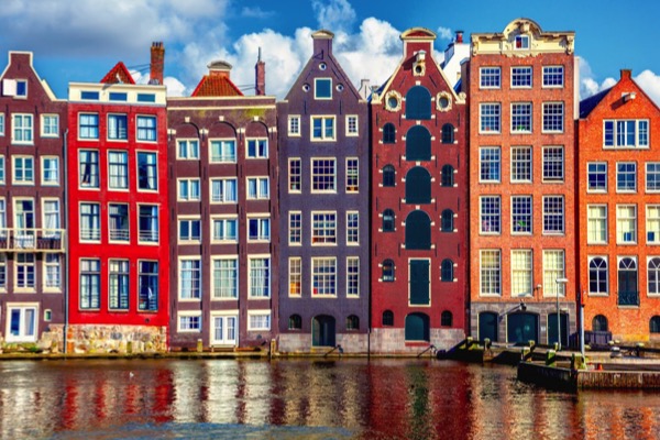
The image can be left or right and the optional CTA style link can be configured to open internal or external pages with a new window option.
Image Discs
The image can be left or right and the optional CTA style link can be configured to open internal or external pages with a new window option.
Image Discs
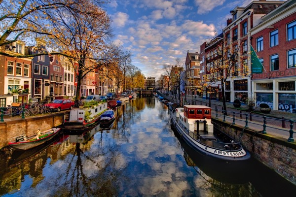
The image has been switched to the right by checking a box in the widget settings.
Two ImagesThis is a two column grid layout where the image is in one column and the text container in the other when viewed on wider screens. On narrower width screens, the layout becomes one column, the image remains in row one and the text is in row two.
Images
The images should be cropped to size before importing into EverWeb. An image width of around 800px is wide enough for most purposes.
The image has controls for setting the border width, border color and border radius.
Text
The text block is centered vertically and has an h1 heading, a paragraph and an optional CTA style link. The font can be web safe or non web safe or Google hosted with a web safe fallback.
The heading has controls for font size and text align. The text has controls for font size, color, text align and line height.
Link
The liink can be configured to open internal or external pages and in a new window if required. There are controls for setting font, hover and background colors and the border radius.
The heading text and link can be spaced out vertically.
Container
The container backgound and the wrap background both have controls for adjusting their color and opacity and there is a vertical spacing control to adjust spacing relative to the items above and below.
The break point at which the image becomes full width can be set for tablet landscape, tablet portrait, phone landscape or phone in portrait mode.