Hero Switch To Responsive
The image is full width, fixed height on computers and switches to responsive on touch devices.
The image can be fixed for scroll over on computers.

Scrolling Text Using CSS Animation
Although it's possible to create a full width, fixed height image using EverWeb's basic features, it's not a good idea for responsive pages. The image would be far to large for mobile phone users and the fixed height image doesn't display too well on touch devices.
Images
The image is inserted in three different sizes - one for computers, one for narrow browser widths and tablets in landscape mode and one for tablets in portrait mode which will give retina @2x quality when viewed on phones in portrait mode.
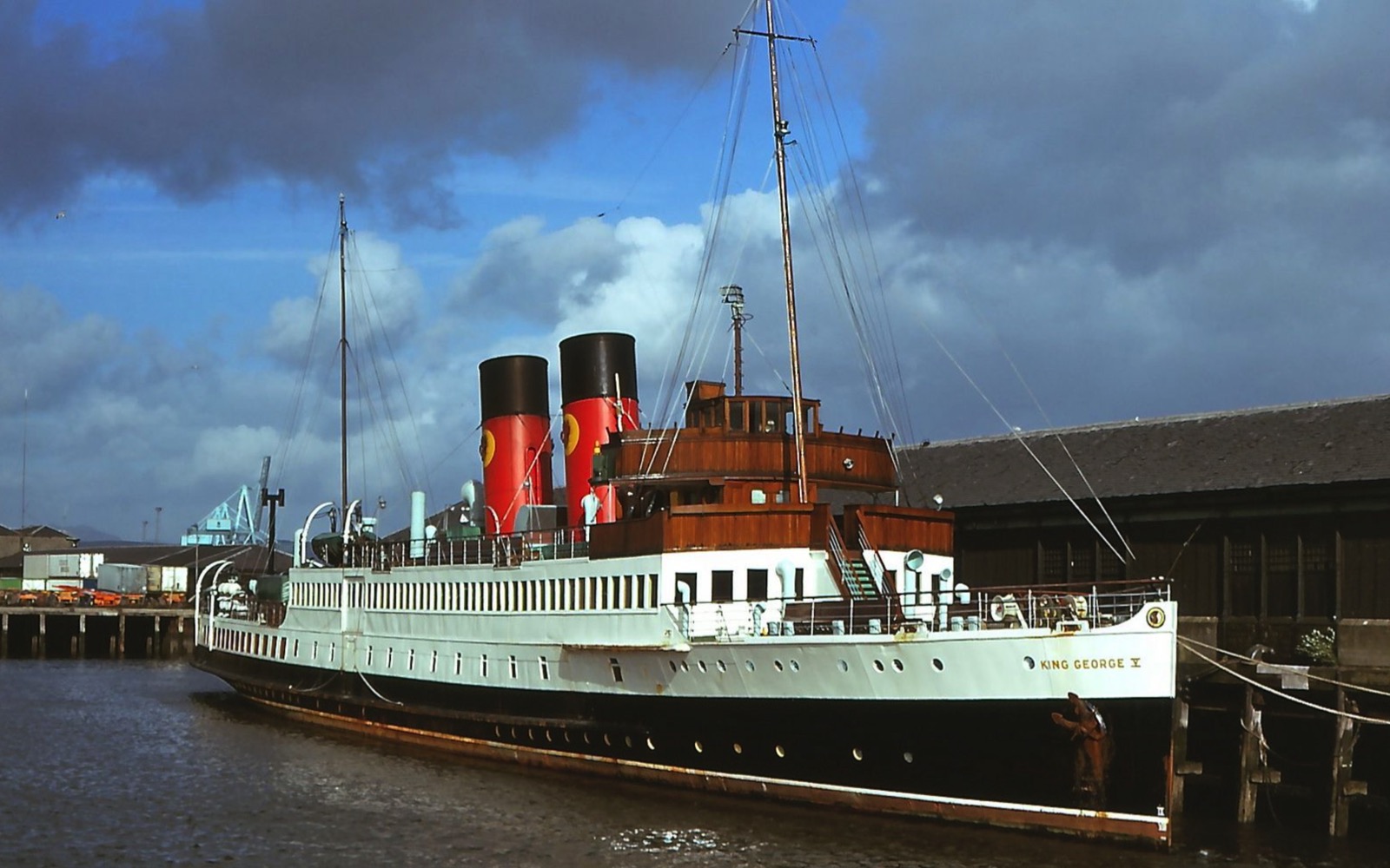
The large image used in this demo is 1600px wide with a file size of 360Kb.
The medium image is 1200px wide and weigh in at under 200Kb.
The smaller image is 800px wide with a file size of only 40Kb.
These images are inserted using the HTML5 <picture> element which means that they can also have alt text for the search engines.
Switch
The image is full width with a fixed height when viewed on computers. On tablets in landscape and portrait mode and phones in landscape mode the image becomes fully responsive. On mobile phones in portrait mode the image height becomes 100vh which fills the height of the device window.
Fix
When viewed on computers when the browser width is 1200px or more, the image can be fixed in position to allow the content below to scroll over it.
Overlay
The full size overlay can animate in on page load and has controls for the animation time and delay which are set in seconds.
The overlay can show a centered heading and paragraph with an option for a CTA style link. The items can be spaced out vertically and the link can be configured to open internal or external pages and in a new window if required.
This group has a maximum width setting and can also show a background with controls for the color and its opacity. When this background is set, the overlay opacity can be reduced to zero if required.
Scroll Over
Most of the responsive items created by EverWeb Widgets have two settings for the background color and its opacity. When using these widgets, the Page Content setting in the Page inspector panel should be set to "none".
In the above example, the widget content background opacity is set to zero and the full width wrapper background is set to black with an opacity of 66%.
Testing
It is really important to test responsive pages in the browser at various widths and in the iOS Si,ulator using an iPad and iPhone simulation both in landscape and portrait modes.