Jumbotron
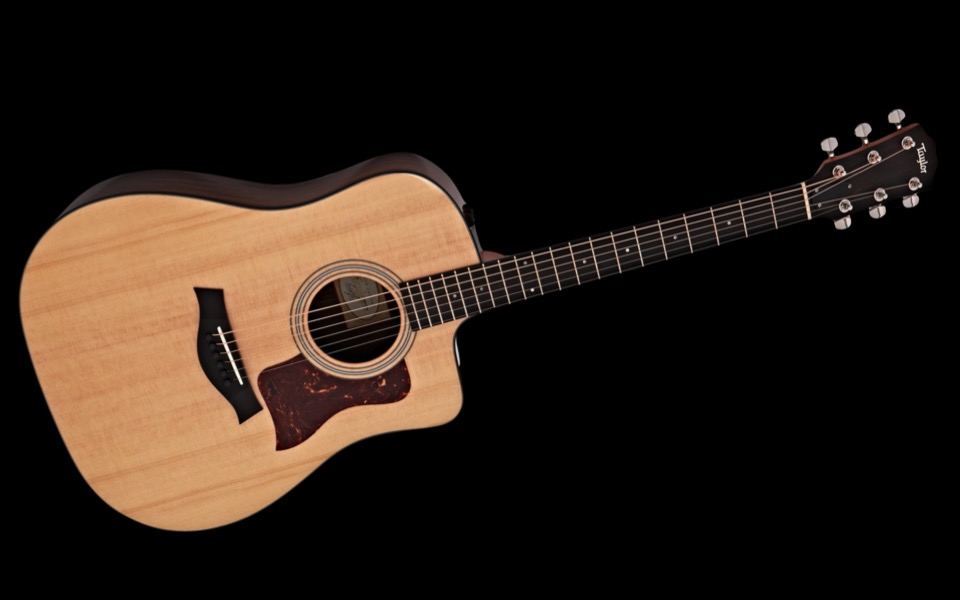
In this example of a Jumbotron it has an image background rather than a two color gradient, the layout is switched and the column relative widths set to 2:3.
In this example of a Jumbotron it has an image background rather than a two color gradient, the layout is switched and the column relative widths set to 2:3.
This example of the ThemeKit Basic Jumbotron shows the image background option and the text align left with animation.
The images for the example were resized and optimised before importing into EverWeb …
Unlike a hero item the Jumbo tron does not have a fixed height. The height is decided by the height of the tallest content item plus the value of the percentage top/bottom padding.
This makes it a better option for a responsive web age than a fixed height hero.

Any content width image on a responsive web page needs to be inserted in at least two sizes - if not three. If the image is to be properly indexed by the search engines it must have alt text and be inserted in an HTML5 <figure> element along with a <figcaption>. The figcaption should include the image title and a text description.
Images
The ThemeKit Elements Image widget inserts the image file in three sizes. The images in the demo are 960 x 600px, 600 x 375px and 360 x 360px and were optimised before importing into EverWeb. A square or portrait image gives a lot better user experience when viewed on a mobile phone in portrait mode.
Styles
The definition of an image can be improvide in most cases by adding a 1px border to separate it from the background.
Adding a box shadow to the bottom edge helps to lift it off the canvas and can be achieved by using a negative spread radius.
SEO
Using the figure and figcaption elements effectively lets the search engines know that the text info is related to the image.
Link
When an image is comfigured as a link on a responsive web page it needs an icon to let mobile device users know that it is a link. In this case the icon appears at the top right and animates on hover.
A large footer jam packed with hard to read and find info has no place on a responsibe website which will be viewed on small protable devices. It is just a waste of space and requires unnecessary scroll for mobile device users.
The footer bar is a much better way to finish off a page. The ThemeKit Basic Footer Bar widget has all the items which should be in view at the bottom of each page.
The bar has an internal link which can be to the home page or an info page with all the stuff usually found in a footer.
The phone function is optional. It shows the phone number on hover and becomes a phone call function on mobile phones,
The copyright tab shows the © info on hover and has the option to auto add and update the year.
There is a spam protected email function follwed by a smooth scroll to the top action tab.
The icons can be round or square and the footer bar has a show/hide function so that it hides on scroll down and appears when the bottom is reached or on scroll up.
Menu

