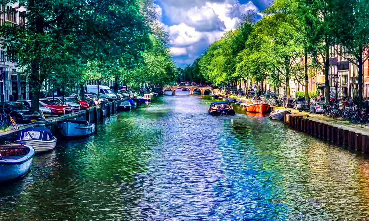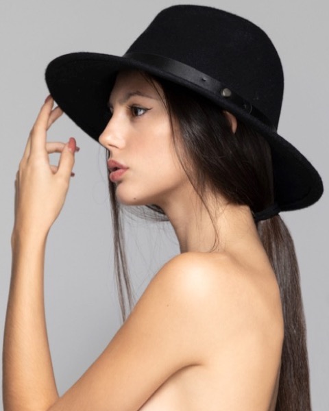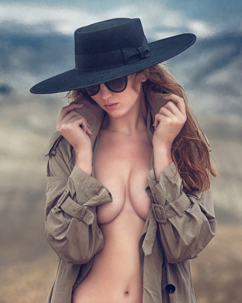
Get The Hat
Make a grand entrance on every occasion with a custom designed hat
Buy NowMore InfoThe grid has three columns with two images in HTML5 <figure> elements and a heading, text and two optional links in an HTML5 <article>.
The realtive column widths can be adjust. In the example they are set to 3-2-3
Images
Each image has its own controls to rotate it at a positive or negative angle and the scale reduced to compensate. There are also controls for border width and color.
There are shared controls for setting the offset box shadow radius and color. Each image has its own controls for setting the shadow direction on the X and Y-axis.
Break Points
At the first adjustable break point the images sit side by side and the text sits below them. On phones in portrait mode the items align themselves vertically.
Links
The links are optional and can be turned on individually. The first link can open internal or external pages with a new window option. The second link is internal.
The links have controls for changing their style - border width and color, border radius, link size and color, and background color and its opacity opacity. They can be style like Apple links by adding two of the HTML symbols for a heavy right pointing quotation mark - ❯
The row can have 2, 3 or 4 images. When three images are present the last one is centered on browser/device screen widths below the break point.
Block Hero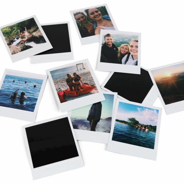
Each item has an image with alt text, a heading, optional span, text and an optional link.
Links can open internal/external pages and have a new window option.
The grid layout has 2, 3 or 4 columns with controls for grid spacing and grid item spacing.
The wrapper background has options for a two color gradient with adjustable angle.
The grid layout has three columns with two images with optional captions and a text block with heading, text and optional link.
InfoThe image is inserted in an HTML5 figure element with alt text and an options for a figcaption and a lightbox icon. The caption and icon can show on hover.
The heading, text and optional link are inserted in an HTML5 article element.
The lightbox image is responsive up to the full with of the image file.
The relative column widths can be adjusted and the image can have a border and/or an offset box shadow.