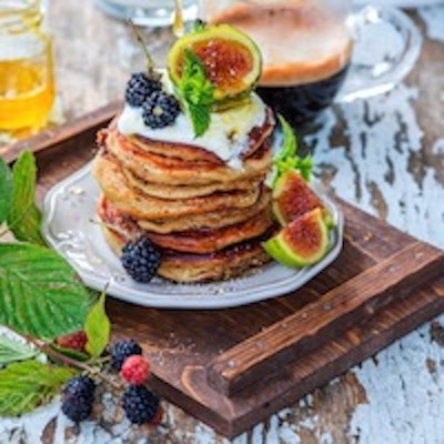
Pancakes
July 12thPancake stack eating contest
The grid shown above has pairs of image/text blocks. Each block has an image with alt text and optional link, a heading, optional span and text.
The grid can be used as an illustrated navigation or links to latest news/blog posts etc.

This widget can be used where a couple of box images need to be displayed with a fairly large amount of text.
At wide browser widths the grid layout has seven columns. The images span the first two columns and the text block span the other five.
At the break point - in this case for tablet portrait mode - the images sit side by side above the text. On mobile phones in portrait mode the images stack.
When the images are switch to the right of the text, the text spans the first five columns and the images the remaining two.
Image captions can appear on hover when viewed on computers if required and there is an option for a hover opacity animation on the images.
The optional link can open internal or external pages, has a new window option and can be aligned left, center or right.
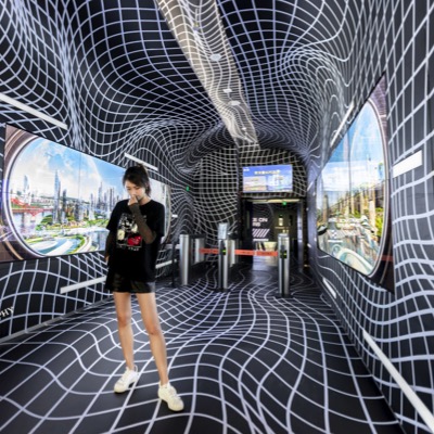
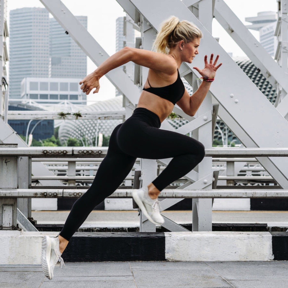
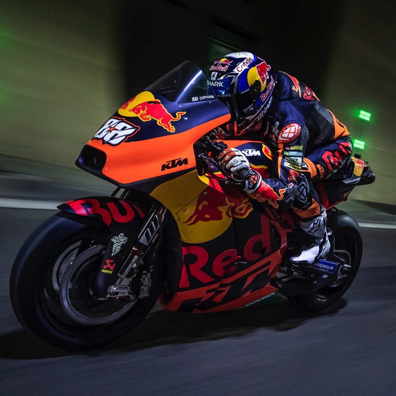
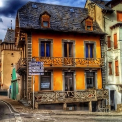
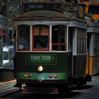
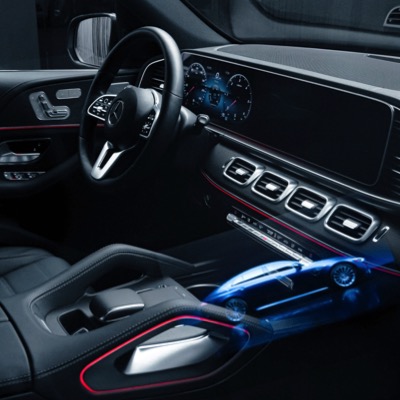
The images used in the example were cropped to 400px square before importing into EverWeb.

The image has alt text and an optional caption which can display on hover when viewed on computers. There is a control for the image opacity effect.
The text section has an optional link which can be configured to open internal or external pages with a new window option.
There are checkboxes to switch the position of the image to the right and to place the text above the image on screen widths below the break point.