ThemeKit Brand Hero
In this example the hero has a two color gradient background.
The bottom padding has been increased to allow the carousel to animate up to overlap it by 100px.
The ThemeKit Brand Carousel can be used to display product links or for an illustrated navigation.
This carousel can show a different number of images for each device type - computer wide, computer, tablet landscape, tablet portrait and phone. The images don't need to be any wider than about 400px depending on the value set for the number of images shown.
Width
The carousel by default is centered with a maximum width setting. It can be made to fill the width of the browser/device window by checking a box.
Captions
The optional captions are centered over the bottom of the image and have controls for font family, fallback font, size color and for the background color and its opacity.
Arrows
The slides can be navigated using the directional arrows or grab and drag on computers and swipe on touch devices.
The arrows can be styled for color, background color and opacity, hover color and hover background.
Arrows can be turned on/off for each device type.
Pager
The optional pager has controls for dot size, round dots, dot spacing, color and active dot color.
The pager can be turned on/off for each device type.
Autoplay
Autoplay is not a desirable feature in any situation but should never be used for an item that is being displayed on battery driven tmobile devices.
The autoplay feature can be turned on for each device type and has controls for setting the slide time in milliseconds and for turning on the pause on hover function.
Links
The images can be configured as internal or external links and there is an option to open in a new window.
Lazy Loading
The images can be lazy loaded by checking a box and this function should be turned on if there are more than about 6 images.
Note that when the lazy load function is engaged some or all of the images may disappear from view on the EverWeb design canvas.

Images should be sized appropriately and optimised before importing into EverWeb. Content or full width images must supply a smaller version for mobile devices.
The content width image is shown above with an optional border and bottom box shadow.
The main image is 1200 x 600px and the mobile version is 800 x 400px.
The version below shows the widget with two images inserted. One uses the link option and the images are sized at 800 x 400px.
Lazy Load
The images have a lazy load option which should be turned on if they are not in view at page load.

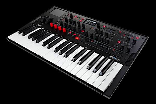
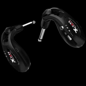
The grid can have two, three or four items.
When three items are present the last one is centered in row two below the breakpoint.
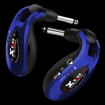
The images can have different aspect ratios and should be sized appropriately.
The images have a lazy loading function which should be turned on if the item is out of view on page load.
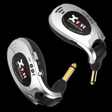
There are 20 types of animation to choose from and the animations can be swept or staggered by checking a box.
Perspective can be applied to the items using a slider. The higher the value - the less the effect.