Poly Clip Hero
The text section has a maximum width setting and can be aiigned left, center or right on browser/screen widths above the break point. It has a heading, text and an optional link.
In this example the top angle is set to zero.
The text section has a maximum width setting and can be aiigned left, center or right on browser/screen widths above the break point. It has a heading, text and an optional link.
In this example the top angle is set to zero.
The clip angles and padding values that have sliders for control use viewport width units. The height of the polygon is adjusted using the value for top/bottom padding.
Hero
The hero item above uses a composite image made up in Keynote.app and has the same background gradient colors and angle as the other polygon items.
Break Point
The clip path is removed on screen widths less than the break point. The items on this page have their break point set for mobile phones in portrait mode.
The <article> is in the left column with a relative width of 3 and the <figure> is in the right column with a relative width of 4.
Info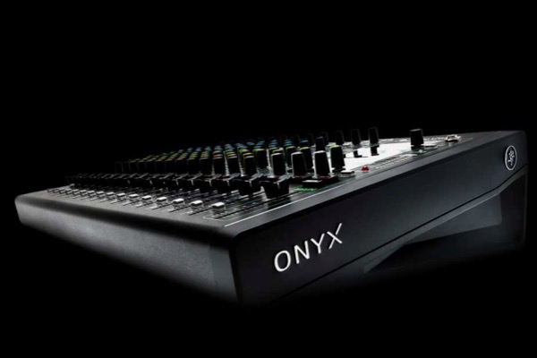
The <figure>is in the left column with a relative width of 3 and the <article> is in the right column with a relative width of 4.
Info
Using angled containers helps to set a web page layout apart from the masses and make it more memorable. The inner container has a clip-path added to its top and/or bottom edge.
Layout
On browser/screen widths above the break point the grid has a two column layout. One column has an HTML5 <figure> element with an image and alt text and the other is an <article> with a heading, text and an optional link.
The relative width of the items can be adjusted and their positions can be switched. Either the text or the image can be on top on screen widths below the break point.
List with custom markers …
Video player with MP4 plus HD option or Vimeo/YouTube video.
Custom control bar with dark or light option.
The slideshow has separate options for navigation on computers and mobile devices.
It can autoplay on computers with a fade transition and manual paly on touch devices using swipe.
The ThemeKit Stage widget is used on this page to provide a gradient background that shows between the clip items.
In this application a two color gradient with a 90° gradient angle was used. The angle and the color stops are adjustable and the gradient type can be switched to radial by checking a box.
Image Background Option
Instead of inserting a large image in the browser background it inserts three different sizes of image - fixed in position - which fill the viewport rather than the whole browser which is much more efficient and gives a better user experience.
The images used in the demo are 1000 x 1000px, 600 x 600px and an image with an aspect ratio of 9:16 for mobile phones at 375 x 667px for mobile phones in portrait mode.


