ThemeKit Columns

Menu

Scrolling Sidebar

ThemeKit Column Sidebar Scroll

Sidebar Scroll

A sidebar can be used to display and provide links to product options, product build and similar products.
Main
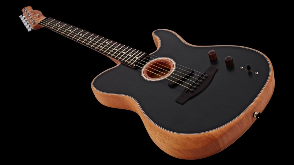
The image is optional and has alt text, optional lazy loading and is inserted in two sizes for computer and mobile devices.
Sidebar
The sidebar has a sticky header width a scroll down icon. It has a fixed width and any overflow will scroll into view. Below the breakpoint the sidebar items appear below the main section.
The optional links can be set up for individual text or common link text by checking a box.
There is an option to remove the sidebar's vertical scrollbar if required.
NOTE
This example does NOT use the fixed sidebar height with overflow scroll below the breakpoint option.

Sidebar Grid

Column Sidebar Grid

Main Article

A sidebar can be used to display and provide links to products, product info, similar products. blog posts, podcast episodes and large website sections and product types.
Main
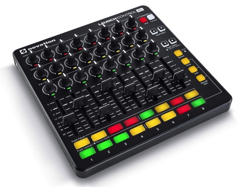
The is section has an image width alt text and optional lazy loading, a heading text and styled spans for sub headings etc.
Sidebar
The sidebar has a sticky header width a scroll down icon. It inherits the height of the main article and any overflow will scroll into view.
Media Queries
On computers the sidebar has two columns and on tablets in landscape mode it has one column.
On tablets in landscape mode the article and the aside columns have equal width and on phone in portrait mode the sidebar is below the article.

© EverWeb Widgets -