ThemeKit Combo Product
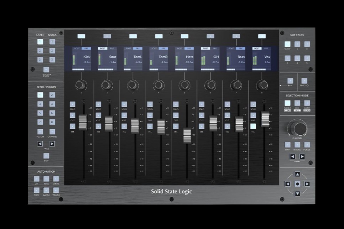
£ 1199The grid layout has three columns with an image with optional caption, a text block with heading, text and optional link and a styled with optional heading.
Buy Now
![Slide [1]](ewExternalFiles/imac-24-1.jpg)
£ 1199The grid layout has three columns with an image with optional caption, a text block with heading, text and optional link and a styled with optional heading.
Buy Now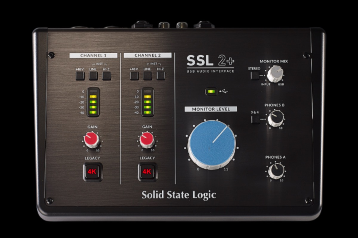
£ 225The SSL 2+ brings together the best of our technology with the right features and expanded I/O capability to get the most out of creating recording on a Mac or PC.
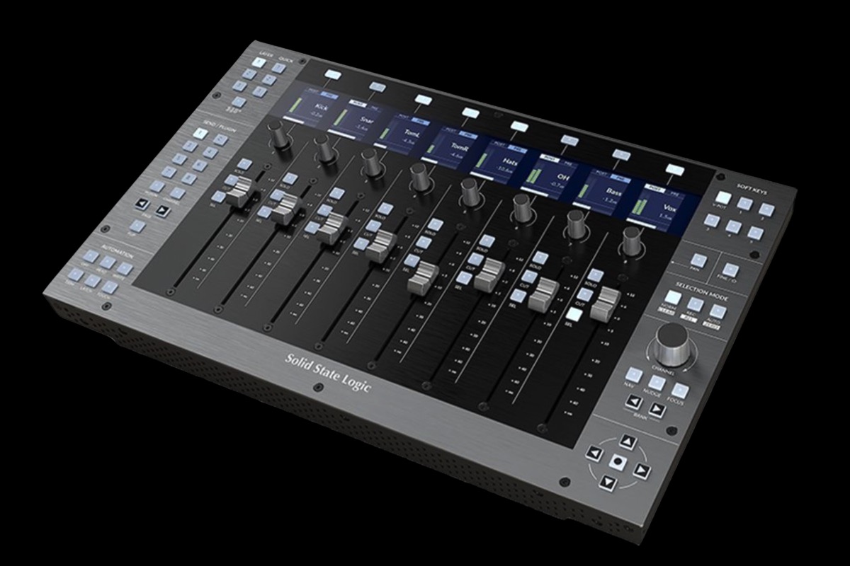
Discover MoreThe ThemeKit Combo Product widget has a three column grid layout with an image, text section and a list.
Image
The image has an optional overlay caption and can display the caption and icon on hover when viewed on computers. The first slide image is also selected in this widget.
Text
The text section has a heading, text and an optional link for opening internal or external pages.
List
The list section has an optional heading. It can display up to 24 liste items has a choice of eight different list style types.
Combo
The ThemeKit Combo Product widget combines with the The ThemeKit Combo Pro Gallery widget to create a lightbox slideshow when the grid image is clicked or tapped.
The ThemeKit Combo Pro Gallery widget can be inserted anywhere in the stack of items on the page. Its height is adjustable so that it can also be used as a spacer.
Slider
The lightbox slideshow can display an assortment of images with different aspect ratios with an animated caption which can appear at the top, bottom or outside of the image at the bottom.
Slides are navigated using arrows or grab and drag on computers and swipe on touch devices.
Options
The images are lazy loading and there are options fade or slide transition, transition time, a slide counter, preload previous and next, disable right click, width and height ratio and scale to ratio.
Styles
The captions can use a Google hosted font with a web safe fallback if required. The captions have controls for font size, color and for the caption background color and its opacity.
The font color is used for the counter, previous/next tabs and the close button. The lightbox can be closed by clicking/tapping anywhere outside the image.
The lightbox overlay has controls for setting its background and opacity.
Combo
Obviously the product and the gallery widgets must have the same ID. Make sure there are no spaces or special characters in the ID.
On this page the IDs are ProGallery-1 and ProGallery-2.
Anchor
The second gallery widget on this page uses the optional anchor to combine with the scroll down feature in the first heading just below the header.
The ThemeKit Combo Header widget has a two column grid layout with a logo/link in column one and a heading which can be set up as h1 through h4. The background can be a solid color or a graadient with adjustable angle.
On screen widths below the break point the logo remains in row one and the heading text moves to row two.
Logo
The logo has controls for choosing the image. image width, logo padding and for selecting the file path to the internal page it links to.
Text
The text has controls for using a Google hosted font with a web safe fallback, font size, phone size, font style and weight, color, text shadow radius and color and letter spacing.
The height of the header can be adjusted using the control for top/bottom padding.
Header Position
The control for setting the header's position type has three options
[1] Relative allows the heading to scroll with the rest of the content
[2] Absolute makes the header overlay the top item and scroll with the page content
[3] Fixed fixes it at the top to always remain in view.
The widget has a control for setting the z-index (stacking order) when the absolute or fixed values are used.
The ThemeKit Combo Heading widget has a two column grid layout with an h1 through h4 heading and an optional scroll down icon. The background can be a solid color or a graadient with adjustable angle.
Text
The text has controls for using a Google hosted font with a web safe fallback, font size, phone size, font style and weight, color, text shadow radius and color and letter spacing.
The height of the header can be adjusted using the control for top/bottom padding.
Smooth Scroll Down
The scroll down function has an SVG icon and a control for setting the ID of the target anchor.
The heading itself can also be used as an anchor by turning on the function and enter the ID of the scroll down link.
On this page the heading at the top - just below the header - is configured as a smooth scroll to an anchor set up in the second instance of the ThemeKit Combo Pro Gallery.
The ThemeKit Combo Toggle Tab is fixed at the top left or right on screen widths above the break point and at the bottom left, center or right below the break point to make it easier to reach for mobile device users.
Clicking.tapping the tab opens the navigation menu overlay.
Both the navigation and the tab have a fixed position so they can be inserted below the footer widget on the EverWeb design canvas.
Tab
The tab has controls for icon color, hover color, background color and its opacity, padding and border radius as well as the positioning controls.
Navigation
The overlay has controls for background color and opacity and the links appear in the center. The navigation has a grid layout and the number of columns will depend on the max-width setting and the link min width setting.
There are controls for all the usual functions and for adjusting the grid column and grid row gap.
Overflow
The navigation can have any amount of links. If the height of the navigation gets to be higher than the device's screen height any overflow will scroll.
The bar has SVG icons with tooltips for Vimeo, YouTube, Image, iFrame and Map to appear in a lightbox overlay on click or tap.
![Slide [2]](ewExternalFiles/imac-24-2.jpg)
![Slide [3]](ewExternalFiles/imac-24-3.jpg)
![Slide [4]](ewExternalFiles/imac-24-4.jpg)