ThemeKit Graphic
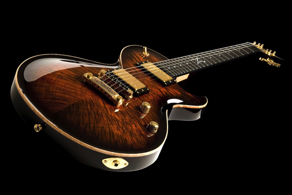
HeaderEverWeb ThemeKit Graphic Header with optional image background and a gradient heading.

EverWeb ThemeKit Graphic Header with optional image background and a gradient heading.
This text block uses the ThemeKit Graphic Design Text widget without the optional header to show how the text can overlap the item above with or without the animation
ThemeKit Graphic Design Header has options for an image or a two color gradient background. Its height is set by the content height and the percentage values for top and bottom padding.
The padding can be adjusted to move the content vertically and to allow space for the overlapping item below it.
Images
The image is inserted i three sizes and were resized and optiomised before immporting into EverWeb.
The images usedin the demo are …
The content is enclosed in an HTML5 <article> element which is centered horizontally with a maximum width setting.
It has a heading, optional styled span, text and an optional row of links.
Gradient Heading
The gradiebt heading option uses background clip and transparent text-fill to allow a two or three color gradient to fill the text.
Navigation
The navigation can have a mix of internal/external links. They have controls for horizontal and bertical spacing and hover animation on the text/border color.
The ThemeKit Graphic Design Heading widget creates an h1 through h3 heading with the option to add a logo link.
Ehe EverWeb Widgets and ThemeKit Widgets use HTML5 containers. The first heading in an HTML5 container is always an h1
With an HTML5 layout only three types of heading are required …
A horizontal menu at the top with dropdowns for directories should be avoided since it omly causes confusion - especially for mobile device users.
Designer websites should have two navigation menus - one for the directories containing different projects and the other for the pages.
The directory/section menu should have representative image.
The Graphic Heading widget has the option to be used without the logo and leave space for two navigation menu action tabs.
In this case a checkbox is supplied for adding space above the heading text on mobile devices.
Follow the link beow to see the ThemeKit Graphic Image Menu in action in the x Graphic Design section …