Guidelines
Content
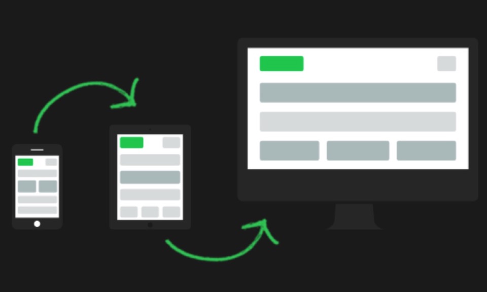
Mobile users need concise information while desktop users need more detail. They are much more likely to leave the site due to unnecessary distractions like popups and autoplaying sliders.
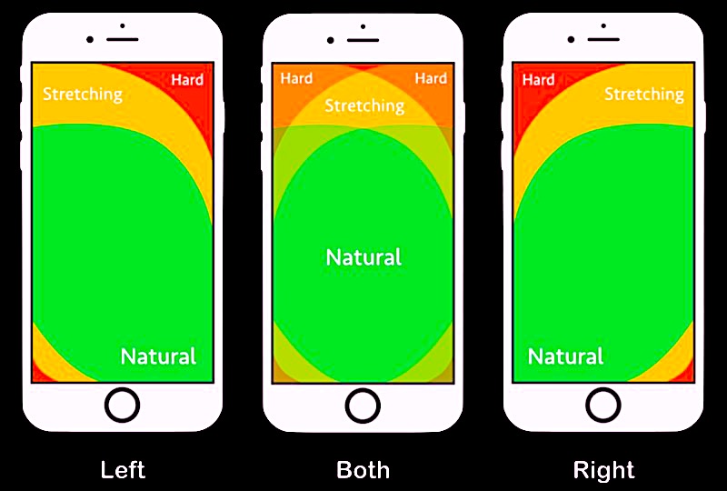
Think Vertical
Vertical thumb swiping is much easier than horizontal swiping.
Action Tabs
Tabs to open navigation and other items should be inserted in the bottom half of the screen for easy access.
Navigation
The navigation should be fixed, centered and vertical with any overflow accessed by vertical scroll.
A common practice is to insert the mobile navigation tan at the top right or left of the screen. This is the worst possible place for it and any other action tabs!
Contact
Contact info must be visible at all times and easy to use. Spam protected email links should replace contact forms. If a contact form is used it should have the minimum of fields, no drop downs and definitely no reCaptcha.
It's better to remove the contact form for mobile phones and replace it with an email and a phone action tab.
Images
Standalone images and those in hero items and slideshows should be optimised and have a file width of no more than 800px.
Images should be clear and sharp and preferably have a square or portrait aspect ratio.
Never use autoplay, place the caption inside the image and use vertical swiping where possible.
Images should be lazy loaded and available in a smaller size for smart phones.
Video
Use self hosted video rather than Vimeo or YouTube. Convert YouTube to MP4 and download it in the smallest size that will give reasonable quality.
Take the video off screen at page load and then lazy load it in in a popup on click.
Make sure the video player container has a caption for inserting the video title for the search engines.
Animation
Most mobile phone users are confused and distorted by animation. Make sure any animations are turned off or kept to a minimum for visitors using smart phones.
Parallax Scrolling
Parallax items should never be used on pages that will be viewed on a smart phone. If parallax is required then a separate site for mobiles should be created with the parallax removed.