ThemeKit UI

ThemeKit UI Image Switch

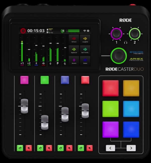
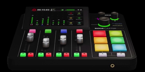
Header + Switch Image + Text

In this examplae the heading is set to overlay the top of the image. The ThemeKit UI Text is inserted below the ThemeKit UI Image Switch widget and set to animate up and overlay it.

Image Switch

The image switches from fixed to responsive height and has …

  • Image inserted in three sizes
  • Image lazy loading option
  • Optional caption article
  • Optional text and one to three links
  • Vertical align - top, center or bottom

Caption Container

The container has a max width and a top/bottom margin control.There are controls for border width,color and radius and to remove the bottom border when the bottom box shadow is added.

ThemeKit UI Display 1ThemeKit UI Display 2

ThemeKit UI Display

✱  Display Module
✱  On Scroll
✱  Scale Animation

Heading, optional span block, text and one two or three links with scale out on scroll animation.

ThemeKit UI Display

The ThemeKit UI Display widget has options for one or two images and a text block;
The images can be lazy loading and have the option to add a border.

Layout

The disply area is a two column grid with …

  • Controls for each items column - 1 or two
  • Controls for each items row - 1, span 2 or 2
  • Controls for each items max width
  • Controls for each items row below the breakpoint - 1, 2 or 3
  • Vertical align - top, center or bottom

Animation

The optional animation reduces the items scale on scroll down. The animation can occur when the item enters the viewport, spans it or when it exits.