Main Image Grid
The main image sits at the top of the grid and fills the width of it.
The remaining images form rows below it and the number of items per row can be set for different browser/device widths. The grid can accomodate up to 48 images.
Images
The main image should be cropped to sams width as the maximum width setting before importing into EverWeb. The smaller images don't need to be more than about 300 to 360px wide.
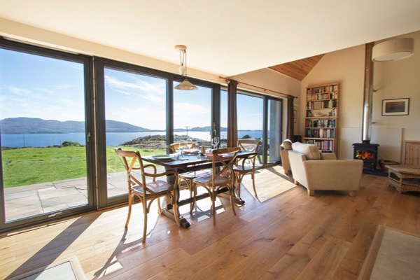
Main Image
The main image can be configured has an internal link if required. It has alt text and options for a heading and/or a caption.
Grid Images
The rest of the images have alt text, optional caption and can be configured as links and these can open in a new window if required.
The number of images per row can be set for each device type - computer, tablet landscape, tablet portrait and mobile phone.
The images can have a border and there is a control for setting a border radius. The spacing between the images is adjustable as well as the all around padding.
Wrapper
The container background color and its opacity can be adjusted and the vertical spacing control adjusts its vertical position in relation to the items above and below.
Animation
There are two optional animations that can be turned on for those using computers to view the page - one to show the captions on hover and the other to add a scale animation to the images.