Layout
The columns are created using the CSS Grid Layout Module. At the maximum width there are 3 columns and one row.
Images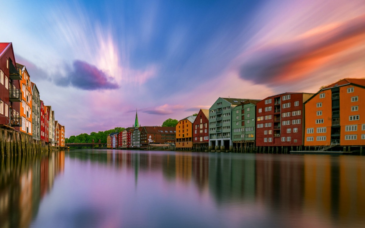
The columns are created using the CSS Grid Layout Module. At the maximum width there are 3 columns and one row.
Images
At the first break point - for tablets in landscape mode - there are two columns and two rows. The first two items remain in row 1 and the third item is centered in row 2.
Ionicon
Date/Price
The default content a PNG icon with heading and text.
There are options for a price/date and a CTA style link which is absolutely positioned at the bottom.
The columns are created using the CSS Grid Layout Module. At the maximum width there are 4 columns and one row.
ImagesAt the first break point - for tablets in landscape mode - there are two columns and two rows. The first two items remain in row 1 and items three and four are in row 2.
Ionicon
The default content is a PNG icon with heading and text,.
There are options for a price/date and a CTA style link which is absolutely positioned at the bottom.
Each item has the same animation time. A slightly different delay is set for items 2, 3 and 4. When all four items are stacked vertically on mobile phones, the delay for each is set to zero.
HeroThe RGL Stack SO widgets create responsive rows of items which not only slide up as they enter the viewport but overlay the item above by a preset amount.
The grid has either 3 or 4 columns and the layout changes to 2 columns below the break point. When there are 3 items, the third one becomes centered in row 2. On mobile phones in portrait mode the items stack vertically.
The grid has controls for grid gap, left/right padding and bottom padding and overlay amount. The items can have a border and/or a box shadow.
The container has a split background, The top part that overlays the item above is transparent and the rest is a solid color with an opacity slider.
Icons
This version is designed for use with icons that are PNG images. They can be square, rectangular or round and there is a control in the widget settings to allow the border and/or box shadow to display properly when round images are used.
The round icons used in the demo were created in Keynote and are 128px in diameter with a file size of 12KB.
Animation
The slide up animation has a control for setting the animation time in milliseconds for all the items and for setting individual delays for the items to create the staggered effect.
The control for Animation Distance is the distance that the items have to travel set in pixels. The greater the distance, the faster the items will enter the viewport.