Grid For Dummies
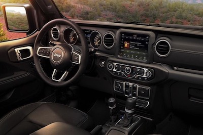
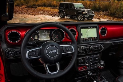
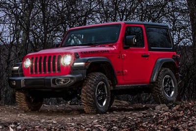
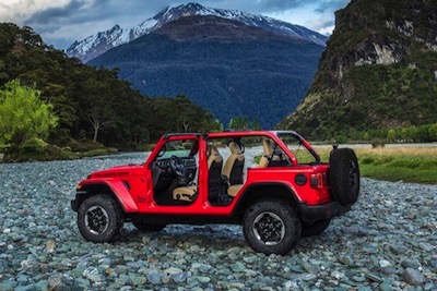
This grid will suit those who don't know or care that they should crop all their images to a suitable size and aspect ratio before importing them into EverWeb and haven't a clue what a media query is.
The first 5 images in the above grid have all been cropped to a 600px x 400px. The last one is the same as its predecessor except that it is 1200px x 550px making it not only larger but giving it a different aspect ratio. The grid accommodates this by stretching the image to fill the grid item container. It doesn't quite look the same but it fits.
Auto Layout
With responsive grids, the number of items per row is normally set for each device type using media queries. This layout makes it automatic and only requires the thumbnail image minimum width to be set.
The grid item spacing is adjusted using the "grid-gap" property and there are controls for adjusting the left/right padding and the vertical spacing from the items above and below.
Grid Items
Each item is an HTML5 <figure> element with an image with alt text and a <figcaption>. The caption overlays the bottom of the image and can be set to appear on page load or on hover when viewed on computers.
The caption hover uses a CSS animation which transitions the opacity over time.
Captions
The captions can use a web safe font or a non web safe or Google hosted font with a web safe fallback. The font used in the above example is the Google hosted font "Stint Ultra Expanded".
There are controls for setting the font size and color and the background color and its opacity.
Links
The images can be configured globally as hyperlinks. These can open internal or external pages and there is the option to open them in a new window.
Internal links use a relative file path and external links an absolute one. Find out about this by following the link below.
Website Images
Images make up about 80% of the average web page content and are the main factor in poor download performance. Visitors using mobile device will give up and go elsewhere if they have to wait too long for the content to appear.
If your web pages don't download in under 2 seconds, check out the info on how to bulk resize images by following the link below.
Another cause of poor performance is badly formed image file names. Since these become part of a URL, they should be all lower case and have no spaces or special characters in them. Use hyphens to separate the words in the file name so that the search engines can index them properly.
