The image header is used here in conjunction with the two level navigation. The navigation can be placed above or below the header.
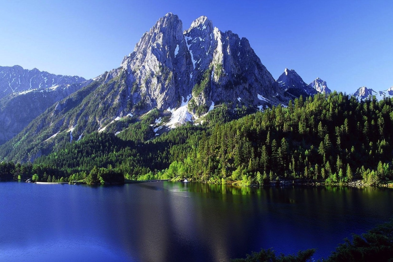
Split headers like this one can sometimes be a better option than a full width one. It has a maximum width setting so that the image size can be contained at wide browser settings. This allows a smaller image file size to be used.
The color of the background exposed on each side of it can be set to the same as the panel background to make the whole thing cohesive.
The panel sits to the left of the image when viewed on computers. On narrower devices, the image slides below the panel and the panel is reduced in height.
The header panel has an optional logo, an h1 heading, an optional h2 heading and one or two optional CTA style internal links.
The image has an overlay caption with adjustable background opacity.
The header widget incorporates the "hamburger" icon which opens and closes the mobile version of the navigation. This is turned on in the widget settings when required and set for icon color and background color.
Mobile Settings
There are controls for setting the panel height when viewed on tablets and another for when viewed on phones. The font size of the h1 and h2 headings can be set smaller for phones.
The two level navigation can be used in conjunction with any of the header widgets - apart from the Parallax header which has its own navigation widget.
The navigation can have up to six top level links and three directories - each with up to six links. The last link on the top level can be configured as an external link and open in a new tab or window if required.
Styles
The tabs have a minimum width setting and their height can be adjusted using the value for top/bottom padding. They can have a separator which inherits the text color and can be adjusted in width.
There is a setting to adjusted the drop down width to suit the amount of link text.
The mobile version of the navigation is vertical so there is a setting to adjust its width. The directories open on click accordion style.
The navigation can use a web safe font or a non web safe or Google hosted font with a web safe fallback. There are controls for adjusting the color, hover color and the background color and its opacity.