Hero Skew Header
Using different shapes on the hero item helps to distinguish a web page design from all the others and creates a more memorable visitor experience.
A vertical navigation on the right hand side has proven to be much more likely to get click through to other pages than a horizontal one.
The hero image container uses two CSS pseudo elements with an adjustable skew angle to create the shape at the botttom.
The optional h1 heading is at the bottom and the navigation can be left, center or right on screenw diths above the break point.
Images
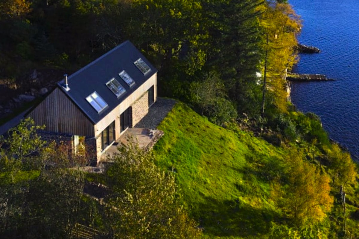
The imge is inserted in three sizes using a <picture> element for each device type and has an alt text attribute, The image that appears on mobile phones in portrait mode has a 9:16 aspect ratio.
Overlay
The image has an adjustable overlay with a CSS grid layout which has controls for background color and opacity.
Heading
The optional heading has a grid layout with two columns each with a <span> for text. The spans are turned on individually.
Navigation
The navigation has controls for width and maximum height. It can have any amount of links and any overflow will scroll on computers and touch devices.
There is an option to add a scroll down chevron icon at the top right.


