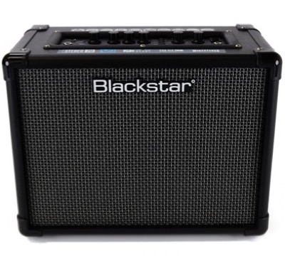
Blackstar ID:Core 20

The image array can have two, three or four items. When three items are present the last on is centered in row two below the breakpoint.
The image array can have two, three or four items. When three items are present the last on is centered in row two below the breakpoint.
Each item has an image width alt text, an optional span, text and an optional link.
The images have a lazy load option.
The heading has adjustable height with an optional animation.
The animations can be staggered by checking a box.
The ThemeKit Array Images widgets creates two to four items with an optional header animation, an image with alt text, a styled span for price/date etc, text and a full width link.
The header has the option to animate out from the left and has controls for animation time and delay set in milliseconds. Checking a box will stagger the delat times to create a more noticeable effect.
The items have an image with alt text, a caption and a link icon at the top right.
The overlay can appear on hover when viewed on computers and the image can have a scale on hover animation.
The presence of the toggle info overlay is indicated by the icon at the top right. Clicking/tapping the image will open the overlay.
When the overlay is in view, the action tab changes to a "close" icon. The overlay can be closed using the tab or by clicking another image.
The images have a lazy loading function which should be used if the item is not in view on page load.
Editing
Each items overlay can be in view on the EverWeb design canvas for editing by checking a box in the widget settings.


