EverWeb Widgets
Array HeroA hreo image with an animated slideover array
CardsImages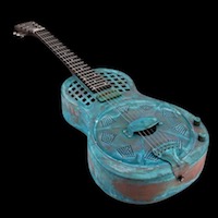
A grid with two, three or four items with images offset at the top.
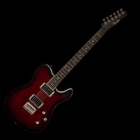
Each item has an image, a heading, optional styled span text and an optional link.
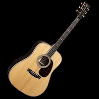
The images can be made round by checking a box and have a lazy loading option.
The staggered slide up and in animation occurs whenever the items enter the viewport.
The ThemeKit Array Slideover Array widget creates alyered item with the image partially overlapping the text area. The images have a lazy load option and can be made round by checking a box.
Overlap
The array can be moved up to overlap the item above - in this case the hero image. This transition can be animated by checking a box and entering animation time and delay in milliseconds.
The items use the CSS Grid Layout Module to create a responsive row with 2, 3 or 4 items.
When there are three columns the last one its centered in row 2 below the break point.
The modal has controls to set the overlay color and its opacity.
It has a scale animation with controls for setting the animation in and out times.
The modal can be closed by clicking/tapping the overlay or the optional close tab.
Each item is an <article> element which can have a border and/or a bottom box shadow.
There is an SVG icon, heading, text and an action tab to open the modal to show more content.

The modals have an optional image with alt text, a heading, text and an optional link.
ImagesThe icons are SVGs and are inserted by opening the SVG download folder, double clicking the file to open it in TextEdit in plain text mode, copyimg the code and pasting it into the SVG code box in the widget settings.
If the modal content has a greater height than the viewing device's viewport any overflow will scroll
CardsThe ThemeKit Array Modals widget creates a row of two, three or four items with action tabs to open modals with more info.
The modals can have an image if required and have a heading, text and an optional link.
Icons
The icons have controls for size, color, background color and opacity, border width, color and radius and padding. The icons can be made round by sliding the border radius control to maximum.
Rows tend to cramp the layout so both the items and the container need to have controls for spacing. Space around allows the item to be found and focused on more easily.
Separation can be enhanced using a border and the design improved by have a bottom box shadow to add a sense of depth.
The modal has controls to set the overlay color and its opacity.
It has a scale animation with controls for setting the animation in and out times.
The modal can be closed by clicking/tapping the overlay or the optional close tab.
The modals have the option to add an image with alt text.
Text
The text area has a heading, styled spans, a paragraph and an optional link.
The modal bar can have quite a few action tabs to open modals with extra info without taking up too much space.
The inline action tabs can have alternating background colors and have controls for vertical and horizontal spacing.
The modals have have an optional image, heading, text and an optional link. They can be closed using the close tab or by clicking/tapping the overlay.
The items can have a border and/or a bottom box shadow and the overlay has controls to adjust its background color and opacity.
It is important to note that all the modals on the same page must have a unique ID number.
For example the modals in the modal row have ID numbers 1, 2 nd 3. The modals in the modal bar have ID nimbers 4 and 5.

