


Offset Image Grid
The best professional web designers are using white space and offset items for a better visual experience. Adding space to a page design actually makes items easier to find.
Offset
Unlike other "code heavy" designs, this one uses the CSS Grid Layout Module vertical align property along with a percentage top margin to offset the odd items.
Heading
The optional heading is positioned absolutely at the top left. It has controls for font size and its position on the X and Y-axis
Items
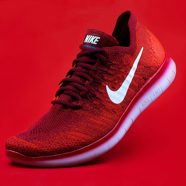
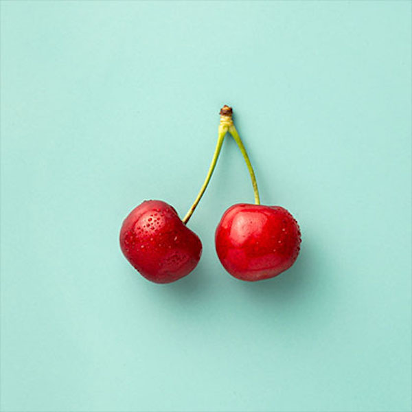
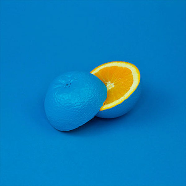
Each item has an image with alt text in a <figure> element with a caption which can run to several lines in the <figcaption> element.
The captions have controls for font family, web safe fallback, font size, color, line height, text align and padding.
The background can be a two color gradient with adjustable gradient angle.
Links
The images can be configured as internal or external links with a new window option. The optional icon can appear on hover and has a control for changing its color.
Images
The images an alt text attribute and can have a border and/or an offset box shadow with controls for switching the offset direction.
The number of images per row can be set for each device type.
Animation
The image scale on page load can be reduced so that it will scale up on hover when viewed on computers. The scale is removed when the page is viewed on mobile touch devices.