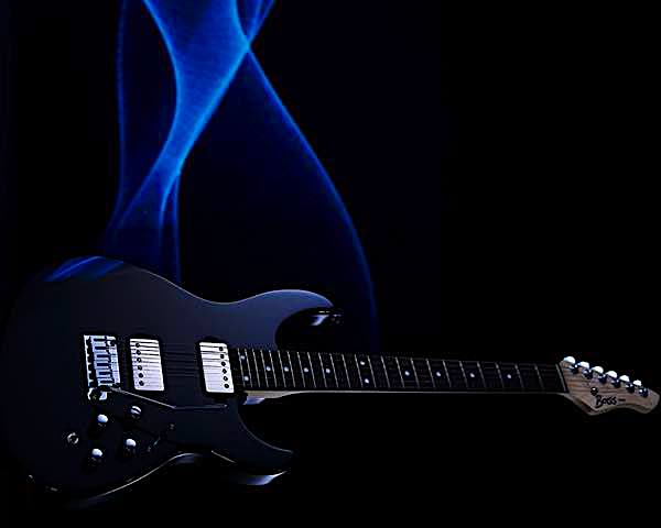
Hero
The hero has a parallax option. The info section can animate in and there are one or two optional links.

The hero has become an integral part of web design - mainly on the home page. Most hero items are badly designed using one full width, fixed height image in the background.
To make sure the hero doesn't adversely effect page download -especially on mobile devices - the image must be inserted in three versions, properly sized and optimised.
HTML5 Picture
It seems to be common practiice to insert the image(s) in the background which means that there is no alt text attribute for inserting keywords for the search engines.
Using the HTML5 <picture> element overcomes this problem.
Image Size
Stellar quality is not required since the images are usually inserted behingd some text content.
The large image can be about 1200 x 800px and the medium one 720 x 480px.
For mobile phones in portrait mode the image should be portrait of course and a size of 275 x 540px will do for most applications.
Processing Images
Resize images using Preview.app and use an optimiser like the freeware ImageOptim. Follow the like to download and install it …
A content width image must be inserted in two sizes. The images used in the item above were sized to 960 x 240px and 720 x 480px before importing into EverWeb.
After optimising using ImageOptim the file sizes were reduced to 20KB and 13KB respectively.
The side by side images below were sized to 600 x 480px with a file size of about 15KB.
Image Links
Responsive website image links MUST show a link icon when viewed on touch devices otherwise the visitor has no clue that the image is a link.