Card Hero
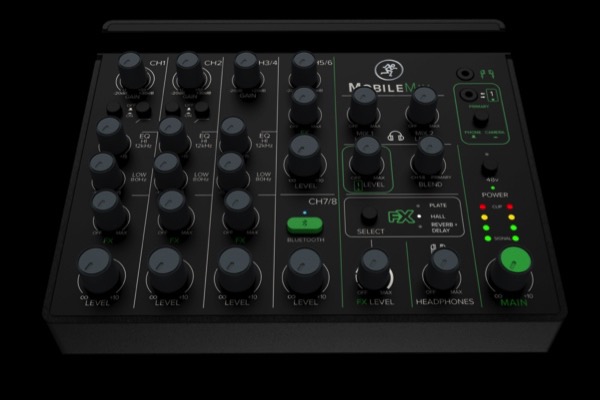
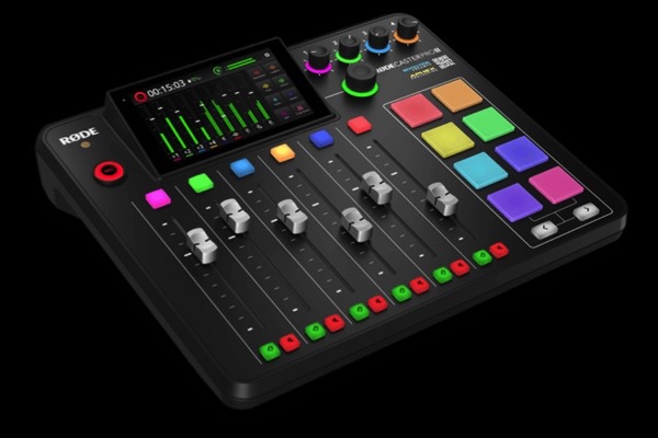
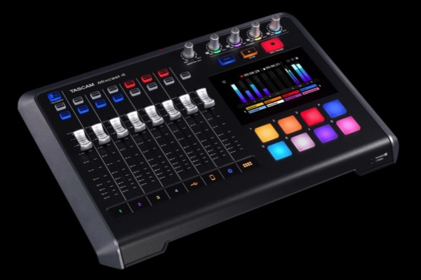
LayoutAn optional header with optional logo/link and a grid with a text block plus one or three images with optional links and animation on load
Cards
An optional header with optional logo/link and a grid with a text block plus one or three images with optional links and animation on load
Cards


The ThemeKit Card hero widget has an optional header, text block and one or three images.
It has the following …
Since this is a hero item all the links are internal and the image links are denoted by an icon at the top right which animates on hover on computers.
Text Vertical Align
The CSS Grid Layout Module allows iteems to be vertically aligned. When the height of the text block is less thean the images it can be aligned top, center or bottom. When "auto" is selected the text block will stretch to the same height as the images.
The EverWeb ThemeKit Card Menu can be used as an illustrated menu to link to directories, sections of a large website or product groups.
The action tab can be positioned left or right so that it can be used along with a page menu to replace outdated and inefficient menus with hover dropdowns.
The menu is visible on the EverWeb design canvas for editing and each items has …
The action tab has an animated menu open/close icon and info text, It can be psoitioned at the left or right and adjusted for position on the X and the Y-axis.
Editing
The menu can be inserted as a the last item or below the footer/footer bar if present.
There is an editing height control to allow all the items to be visible. Before hiding the naviagation links set the editing height to about 100px.
It is pretty much essential to show contact info immediately on page load - otherwise visitors will distrust the website. A toolbar immdiately below the hero item is the best way.
The toolbar has …
The toolbar can be set to overlay the item above if required so the gradient background controls have opacity sliders.
Menu