ThemeKit Cards
JumbotronThe Jumbotron can have a solid color, two color gradient or an image background.
The heading has the option to have a two or three color gradient.
Links are optional and can open internal or externl pages.
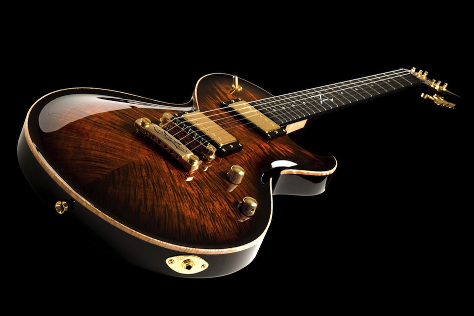
The Jumbotron can have a solid color, two color gradient or an image background.
The heading has the option to have a two or three color gradient.
Links are optional and can open internal or externl pages.
A Jumbotron is use to draw attention and link to an important item, new item, special deal etc.
The ThemeKit Card Jumbotron has an unusual method of setting the height by using the height of the content plus setting a percentgae top/bottom margin.
It has the following …
There are slider controls for setting a percentage value for the top and bottom padding.
In the example the values are 5% and 25% respectively which moves the text dowmwards.
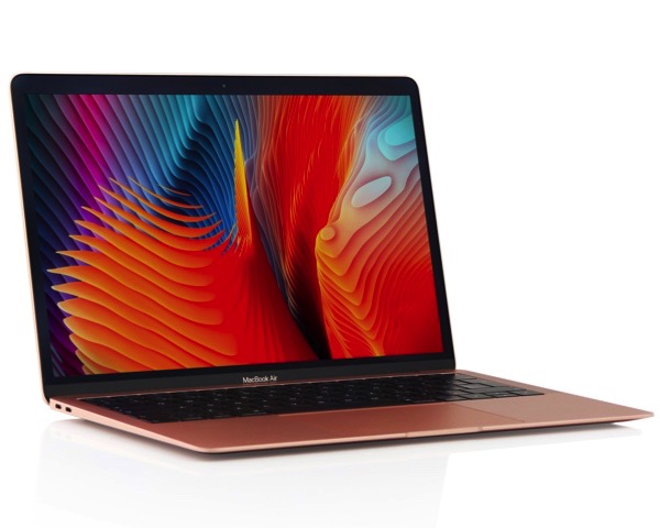
Each item is an HTML5 <article> with a two column grid layout containing an image and a text block.

At the first breakpoint the text block moves below the image.
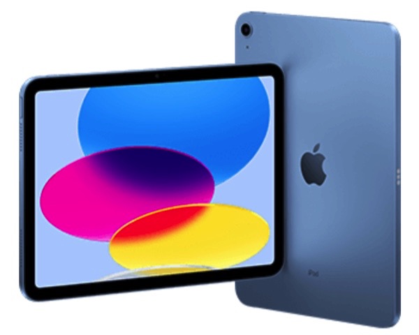
Images have alt text and a lazy loading option for faster page download.
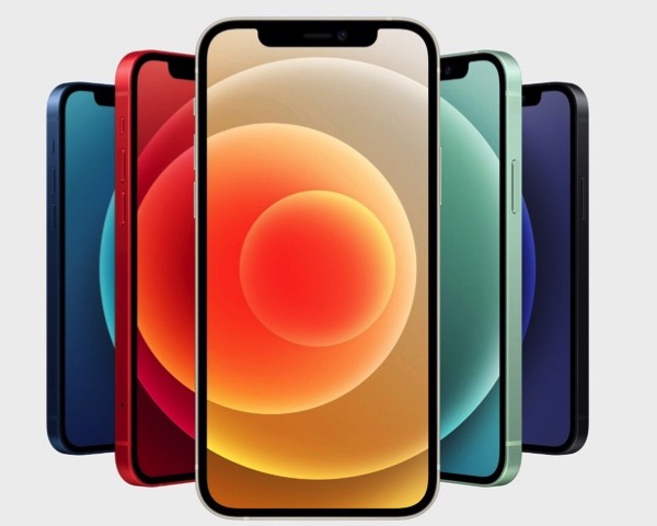
The <article> itself can be configured as a link denoted by the animated icon at the top right.
The ThemeKit Card Grid widget uses a two column grid layout for the container and also for the cards themselves.
On wider browser widths the card has the image in the left column and the text block in the right. At the first breakpoint the text moves to row two.
On phones in portrait mode each card occupies a row of its own.
Cards have …
The card grid has the option to add a main heading with controls for font size and color and for adding a text shadow to thicken up Google hosted fonts with only one font weight.
MENU