Hero Scroll Over
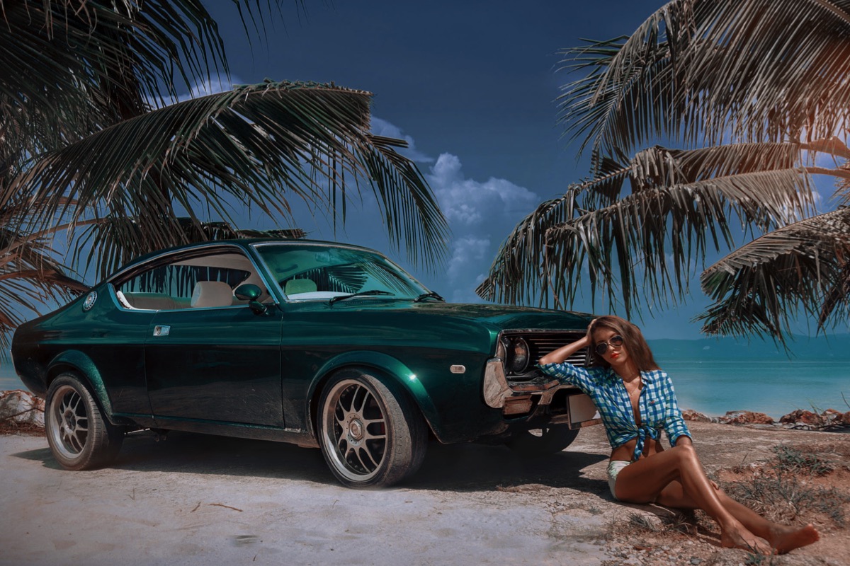
In this application a hero image (full width, fixed height) is used as a much more efficient way to insert a background image in a responsive page. Instead of having to fill the ful browser background, the image only has to fill the width and height of the viewport. To make it even more efficient the image is inserted in three sizes to suit the various devices.
Clearfix
In normal circumstances a fixed item will allow relatively positioned items inserted below it to slide up over and cover it when viewed in the browser. To prevent this a clearfix is used whose height is set in viewport units with the maximum being 100vh.
The clearfix is set to 75vh in the example which allows the content below the image to overlay the bottom by 25%.
NOTE: Since EverWeb cannot handle viewport the clearfix are given a height of 480px when viewed on the design canvas so that it can be seen while editing. When published the image will fill the viewport height.
Images
The images used in the demo were cropped to 1200 x 800px, 800 x 533px and 375 x 666 px before importing into EverWeb. The last image which is inserted for mobile phones in portrait mode is cropped to a 9:16 aspect ratio for a better user experience on phones.
Overlay
The optional overlay at the top has a two column grid layout and can have a gradient background with adjustable colors, opacity and gradient angle.
Logo
The optional logo is inserted in the left column of the overlay and can be configured as an internal hyperlink if required.
Heading
The heading spans both columns. It is in row one and switches to row two on screen widths below the break point.