ThemeKit Gym Hero
A hero with an article which has the option of five custom animations and can be aligned left, center or right.
Parallax
The parallax scrolling is an option with a control to set the value of the effect.


Each item has a heading, optional span and an internal/external link with new window option.
Media
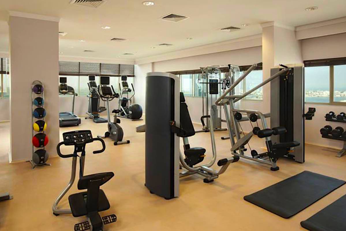
A full width fixed height hero image must be inserted in three sizes and a content width image should be inserted in two sizes.
All images should be sized appropriatly and optimised before importing into EverWeb.
Page Speed Insights
Follow the link below to find out how to test your responsive website for download performance …
Ideally the page navigation should be vertical and the mobile navigation action tab should be in the bottom half of the screen for the convenience of mobile device users.
Repeat
Normally navigsation is inserted on every page of the site which is an unnecessary repetition. Most websites have the logo set up as a link to the home page. If a home link is included in the pages bottom info bar it is much more convenient for mobile device users to use this to view the navigation which only needs to be on one page.
Directories
Research has shown that lrger sites with diredtories are much easier navigated from a section navigation with links to each directory like the navigation on this page.
Then each directory page has a navigation for its pages rather than for the whole site along with links to return to the home page.
Using this system visitors are less likely to get lost and the website will be a lot more efficient without all the unnecessary repetition of the navigation and the footer.
When your website's function is to sell or promote a service or projects it helps a lot if the navigation shows the product or services with a thumbnail image, heading and a brief text description.
Action
The action tab shows the open and closed state. The menu is a grid in an overlay. When there are more items than can fit into the viewport any overflow will scroll into view.
A large footer as seen on most websites is a complete waste of space and an inconvenience for mobile device users.
Most of the info in these giant footers is never read and the contact info is not easy to find.
Replace the footer with a show/hide footer bar like the one at the bottom of this page.
Bar
The bar is show/hide on scroll and appears when the page bottom is reached. It has an internal link which can be used to return to the home page or to an info page.
There is a spam protected email function and a smooth scroll to the top function with a control to set the scroll time.
Phone
The optional phone function shows the phone number on hover or tap on tablets. It switches to a phone call function on mobile phones.

![ThemeKit Gym Images [1]](ewExternalFiles/gymp-1.jpg)
![ThemeKit Gym Images [2]](ewExternalFiles/gymp-2.jpg)